Wednesday, August 29, 2012

The Color of Italy


Our last post was light in the visual inspiration department so this week we have a color extravaganza for you, all the way from Italy.  Cinque Terre is a small stretch of Italian Rivera between Genoa and Florence. The rugged coast line is dotted with 5 little fishing villages clinging to cliffs over the Mediterranean.


Terraced over centuries the village buildings now cluster together at the very cliff edge over looking rippling blue waters. The area has been named a World Heritage site and is protected as an Italian National Park.


One essential charm of Cinque Terre or "Five Hills" is the purposeful lack of development. Its glow lacks the neon and flash of large cities around the world and instead shines with hand painted color and old world tradition. These villages have maintained their brightly colored orange, yellow, pink and blue buildings in proud fashion. Their commitment to color has even led to  clusters of rainbow umbrellas huddled together  looking out and a flotilla of colorful boats sitting in the teal Mediterranean waters.


- Emily Eifler, Writer, Colour Studio
- Jill Pilaroscia, Principal, Colour Studio

Friday, August 24, 2012

Language and Color: Wine Dark Sea


In the book Through the Language Glass: Why the World Looks Different in Other Languages Guy Deutscher reveals today's subject to be highly charged:
In [the] field of language, culture's incursion into the land of concepts so offended, even outraged, plain common sense that for decades the defenders of nature were mobilized to fight to their last drop of ink to uphold her cause. In consequence this enclave has been at the center of a 150-year war between the proponents of nature and of culture, a conflict that is showing no sign of abating."
What war between culture and nature has gotten Mr. Deutscher and other scholars all riled up this time? "This battlefield is the language of color."

In a previous post on the language of color, we wrote about a South American tribe with no fixed words for color but instead used real world comparisons like "the color of blood" when describing a red object. We also learned that when humans switch from using these types of comparative color words to using fixed color words the processing of color switches from the right to the left hemisphere of the brain. This week we want to delve deeper into the  historic relationship between  color language  and science. We are going to replay a 150 year old color science debate to see the evolution of color language in action.

File:1271754717 william-e.-gladstone.jpg
William Gladstone via Wikipedia
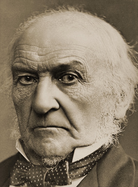
In 1858, William Ewart Gladstone (1809-1898), four time British Prime Minister and Homer devotee, wrote a book entitled Studies of Homer and the Homeric Age. The book marks the first time color language came to the attention of the scientific community.

In it Gladstone introduces the fact the in all of the works attributed to Homer, including the Iliad and the Odyssey, color language differs greatly from modern times. Blue, for example, is never used; instead the frequently used phrase "wine dark sea" appears. Gladstone theorized that this use of language indicated mass colour-blindness in the Greeks. He claimed that "the organ of color and its impressions were but partially developed among the Greeks of the heroic age."

Next to take up the subject was Lazarus Geiger who expanded on Gladstone's ideas by looking at other classic works and hypothesized that man gradually became aware of color over time. He posited the idea that this awareness was connected to the order colors came up in the spectrum, starting with the longest wavelengths. These theories sparked a debate on whether a culture that lacked a name for a color could see that color at all, a argument that developed into the field of Linguistic relativity.

At the meeting of the British Association for the Advancement of Science in 1882,  Dr. Montagu Lubbock read a paper On the Development of Colour-sense refuting the claims made by Gladstone, Geiger and several other contributors to the conversation.  He wrote that while it is true that ancient writings from around the world did not include certain color words:
"Neither in the Vedas of the Hindus nor in the Zendavesta of the Parsees had [Gladstone] found indications of developed colour perception, any mention of blue colour being entirely absent from both, though the sky ... [was] specially considered. Similarly no mention was made of green colour either in the Rigveda hymns or in the Zendavesta though both often speak of the earth and its vegetation."
This doesn't mean that humans developed colour-sense over a few thousand years. He stated that "the arguments in favour of the gradual development of the colour sense in man within historic times were merely philological and that observations among the uncivilised races now living had shown that the extent of the colour perception is not indicated by the variety of terms used to express it." In fact he went on to illustrate the flower insect relationship in early geological time was most likely the first time color vision became an evolutionary advantage. By allowing some insects to see a red flower on an other wise continuously green background, this provided the plant a more dependable method of fertilization.

Its great to see that  the language of color was once a hotly debated subject on the cutting edge of science; and that what we think of as over and done  with was mulled over and debated by many great minds. Color never fails to fascinate.

- Emily Eifler, Writer, Colour Studio
- Jill Pilaroscia, Principal, Colour Studio


Sunday, August 19, 2012

The Color Run


Look what we just heard about! The Color Run! The Color Run is a unique 5 K run held all over the country but instead of focusing on fast finish times this run is about fun. With a motto of  "When life hands you color, run with it"  how could it not be fun!


The race starts with a clean palette crowd, all wearing their required white shirts.. While not as costume crazy as San Francisco's Bay to Breakers race, the runners do come out in playful style. The Color Run specifically encourages non-runners, walkers, young and old to participate in the run, aiming for a memorable experience for everyone.

The race starts with a burst of vibrant yellow powder. Their FAQ explains how it all works: "Each kilometer of the event is associated with a designated color: yellow, orange, pink, or blue.  As the runners/walkers reach the Kilometer COLOR RUN Zones, they are blitzed by our volunteers." The streets are paved and the runners bathed with the brightly colored powders.


But never fear the powders used for the run are 100% natural and safe.  "You can eat the stuff if you’d like (we have tried it and don’t suggest it, it is surprisingly high in calories and leaves a chalky aftertaste)."

Crossing the finish line is a special explosion of color and excitement. What a wonderful way to exercise.   By using  the joy and inhibition reducing effects of color to encourage people to come together the goal is to live healthier. We just missed the run here in San Francisco but there might be one brewing near you. Just in the next two months there are runs in Albuquerque, Birmingham, Salt Lake and Portland. To find a run near you head over to their full list here.

- Emily Eifler, Writer, Colour Studio
- Jill Pilaroscia, Principal, Colour Studio

Wednesday, August 15, 2012

Just the right red


With summer inching toward fall we thought we would investigate the seasons  latest  color treads. The fashion world is always coming up with new ideas for what colors are hip and current and this year is no exception with a color not quite burgundy, not scarlet, not maroon: oxblood.


"After a summer of fruity brights, soft pastels and “gotta wear sunglasses” neons hues, the trend of oxblood as the hottest fall color is a welcome change." Via Bridgetteraes

"Oxblood:  is a deep, rich, passionate red with a name that gives it just enough edgy credibility to distance it from its alter-ego and school uniform staple, maroon. Like it or loathe it, the hue is back with a vengeance." Via Stuff's LifeStyle Section


These pieces are from Jason Wu, Peter Som and Rodarte's Fall 2012 shows. "A new color made an emphatic appearance on the runways for fall: oxblood. A deep red with hints of brown, it's darkly moody and flattering to almost anyone." Via The NY times


While this years hot color might be a big hit on streets and runways  not everyone is so excited about the name and its associations. Oxblood doesn't exactly elicit vegetarian daydreams. This carnivorous color harkens back to Roman power, regal opulence, and religious symbolism  What do you think? Is blood red the color for you?

- Emily Eifler, Writer, Colour Studio
- Jill Pilaroscia, Principal, Colour Studio


Thursday, August 2, 2012

Happy Olympics!

 The summer Olympics are here again ! In honor of this epic event we want to  let our Olympic colors shine. This year is the 100th anniversary of  those emblematic rings.
"The symbol of the Olympic Games is composed of five interlocking rings, coloured blue, yellow, black, green, and red on a white field. This was originally designed in 1912 by Baron Pierre de Coubertin, the founder of the modern Olympic Games. According to de Coubertin, the ring colours with the white background stand for those colors that appeared on all the national flags that competed in the Olympic games at that time." Via Wikipedia

But the rings weren't the only things shining with color at last Fridays opening games. Uniform design is a big part of how the countries individuate their athletes from the sea of people at the opening, and this year there were some bright candidates.

"The colorful yet slightly military Jamaican uniforms were designed by Cedella Marley, daughter of the late Bob Marley, in cooperation with Puma." via Mental Floss


"Unveiled in April, Germany’s uniforms by Adidas sort the sexes by putting women in pink and men in blue, and neither color is from the German flag. The matching scarves are reversible." via Mental Floss


Even this years tickets were designed with color in mind. "Designed by Interpublic's brand consultancy Futurebrand, they each feature a pictogram that corresponds to the sport that the ticket is being sold for, and color-coded according to the venue." via Creativity Online

Bright youthful colors are cropping up all over the Olympics this year.  We also found these illustrations made by Charis Tsevis as the theme for Yahoo’s website coverage of the games (via urbanpeek).  We are frankly loving this injection of fresh modern inspiration! 


- Emily Eifler, Writer, Colour Studio
- Jill Pilaroscia, Principal, Colour Studio