Tuesday, November 12, 2013

Color Icon: Yves Klein

Yves Klein
No color blog would be complete without a post on the great Yves Klein! Born in 1928 in Nice, France, to a pair of painters, Klein rose to prominence in the art world in the post-war era. He, along with art critic  Pierre Restany, founded the Nouveau réalisme movement which is seen as one of the major precursors to both Minimalism and Pop art. Impressive right? But behind the fancy art world credentials was an artist insatiably curious about color.

Monochrome bleu sans titre (IKB 128), 1960 (janvier), 40 x 25 cm
Klein's most famous color explorations were termed the Blue Epoch. Large canvas'  were rolled with a rich  lapis lazulian hue. The color, which came to be known as International Klein Blue (or IKB), has been compared to the blue of medieval depictions of the Virgin Mary's robes. He sealed his secret color recipe for safe keeping and as a record of the "authenticity of the pure idea."

At his first show of these monochromatic paintings, which included not just blue but red, yellow, orange and pink paintings as well, audiences, to Kleins great dislike, took his painting as brightly colored interior design. This reaction lead him to throw out the other colors and exhibit paintings in only his signature blue.

Anthropométrie de l'époque bleue (ANT 82), 1960, 156,5 x 282,5 cm.
The  famous blue, which was co-developed by Klein and Rhône Poulenc a french pharmaceutical company, was tailored to look as bright and high chroma as dry pigment. With his signature color settled he experimented with various methods of applying the paint. He stared with rollers, focusing on evenness and distribution but soon played with sponges, fingers, and even women's bodies as "living brushes."

Grande Anthropophagie bleue Hommage à Tennessee Williams (ANT 76), 1960, 275 x 407 cm.
Color wasn't the only thing Klein explored. His performance art and photography all drove the art world in new directions. There is so much more to learn about this icon in the history of color, read on!

All images via the Yves Klein Archive.

Monday, November 4, 2013

Architecting Color: Emmanuelle Moureaux

© Emmanuelle Moureaux
This week we want to introduce you to a fantastic architect with a commitment to color. Emmanuelle Moureaux, a French native living and working in Tokyo since 1996, is an architect and designer with a passion for color. Her work takes color seriously as an integral part of spaces and buildings not as an  after thought.

The driving ethos of her studio is shikiri, a made-up word meaning “to divide space using colors.” Her goal is to use color to deepen and enrich simple spaces, to “use colors as three-dimensional elements, like layers, in order to create spaces, not as a finishing touch applied to surfaces.”

© Emmanuelle Moureaux

Her intimate understanding of color is clear in her work, like this project the Kyoto University Hospital Clinical Research Center. Using color combinations the resemble landscapes she brings soothing natural influences to a space that might otherwise be teeming with stress or fear, neither of which contribute to good healing outcomes for patients. Her use of color is not limited to bright saturated colors as neutrals also feature prominently in her designs. 

This calming yet professional exam room is a great example of the power of white and neutrals paired with one dot of color. The warm beige, blonde wood, and white stripes extract this medical setting from the realm of the clinical and make it instead a  gentle, welcoming space.

© Emmanuelle Moureaux


Moureaux's latest project was a colorful space for this years Shinjuku Creators Festa in Japan.  The project was inspired by the  traditional Japanese sliding screen

© Daisuke Shima / Nacasa & Partners
Dividing space in architecture often focuses on slicing vertically using walls, dividers, and pathways, but here Moureaux counter-intuitively enlivens the space by bringing the ceiling down to head height. Her dividing of the space applied horizontally compresses the open air to a sliver of space along the floor. The experience is cave like but offers a rippling growth of color overhead. Her work is a rich exploration of the importance of integrating color directly with shape in architectural environments and a real treat for all  of us who love color.

Tuesday, October 29, 2013

Playing with Color


Screenshot If no yes, Rozendaal, 2013
 Bright eye catching  color is often reserved for childhood pursuits with serious or even bland color left to the business suits of adulthood. But color lovers know it doesn't have to be that way. Play time is for every age. 

Take Dutch-Brazilian artist Rafaël Rozendaal. Rozendaal creates art websites with bold playful color. Each site has its  own algorithms that shape, warp and animate fields of bubbly color. 'If no yes,' pictured above, flexes like a kaleidoscope as you slide your cursor across the surface of the website. The magenta pink and pale sky blue  are shattered in to a window pane of mixing gradients. 

Screenshot of Inner Doubts, Rozendaal, 2013
Rozendaal's site 'Inner Doubts' is a maze of trailing gradients, a rainbow that flows along the rectilinear sides and spare angles of a pathway that changes with every click. It is both soothing and a boiling pot of shifting color, a real treat of sumptuous color.  

Screenshot of Everything Always Everywhere, Rozendaal, 2013
'Everything Always Everywhere,' above, is a hushed waterfall of blue gradients, falling forever through the screen. The calmest of all Rozendaal's sites it's reminiscent of ocean wave or falling rain noise generators  in visual form. 'Maybe What,' below is another ode to blue and pink. The sharp triangles of color march to the right, becoming narrower all the time, until they slink off into infinity.

Screenshot of Maybe What, Rozendaal, 2013
These pieces, built for an adult art world, take color and play seriously. The sites are an opportunity  to get a dose of bright color  and too remind yourself that color is one of our creative tools  and can  be enjoyed for its own sake. If you are having a gray day,  have a look though Rozendaal's sites. We promise a smile awaits. 


Monday, October 21, 2013

The Color of 'Emma Approved' Gives Skin Tones a Boost!


If you were watching the Emmy's this year you might have noticed an odd addition to the usual television shows up for awards. Breaking Bad of course won its weight in gold statues but so did Lizzie Bennett Diaries, the little web series that could. The Lizzie Bennett Diaries is a YouTube adaptation of Jane Austen's well loved Pride and Prejudice. For the year it ran the show caught on with YouTube's younger audiences and became a new way for people to interact with and re-imagine Austen's classic.

What does this have to do with color? A new Austen adaptation was just launched by the makers of the Lizzie Bennett Diaries. The show, Emma Approved, has something subtle to teach us about color in the office. Offices, yes even real ones where you are not on camera all the time, are public spaces that become associated with you and your company, whether through face to face visits with clients or customers or just images you share online. Take Emma's office in the show:


Just look at that beautiful set direction! Along with white and warm wood frames Emma's office is painted a vibrant peach, a color which was most certainly chosen to accentuate her look on camera. We don't often think of skin tone colors as options for painting our interior spaces but this specific color of peach seems to support all the faces that have appeared so far in the show.


So not only does this great color show off her her golden pink skin tone but it grounds the shows brand in a physical space. For everything from her logo, business cards, Pinterest boards, office space, website that color becomes her signature. Now this is not an invitation to start wearing all one color, painting your rooms all that color, making your cards and website and Facebook page all that one color, but to encourage you to think about how color can create a subtle thread of connection between your physical space, internet presence, and materials. And picking a color that looks great with your skin tone is just a bonus!

Friday, October 18, 2013

Color Icon: Dorothy Draper


If there was ever a time for a Dorothy Draper, 1889-1969,  revival its right now. This is a women who advocated for every one to be their own designers, for everyone to feel liberated to be creative with their own home, to have adventurous passions and try new things. This is a designer who started small and close to home, redesigning her own home. That simple choice led to friends and relatives recommending she try professional design and when she did, a status quo smashing career resulted.


Dorothy was a clear break from the Victorian sometimes dark and heavily draped interiors. She abandoned the constraints of minimalism, a design trope wrongly dubbed masculine, and her style became known as the modern baroque, a maximalist revery in bright color and bold pattern held together with the classic lines and shapes of traditional luxury.


She made sure her design was multifaceted. The over all design must not only be functional for the people living in the home or working in the office being redesigned but the space needs to comfort and invigorate them, soothe them after a long day and welcome them home from a trip. She made homes important, not the second class citizens of architecture, before branching out and encompassing hotels, restaurants, theaters, and department stores.


But her career wasn't just about subverting the design tradition that came before her.  She lit the first sparks of todays DIY ethos. Even back in 1939 when her book Designing is Fun! was first published Dorothy saw interior design, a diverse field sometimes denigrated to lesser importance by those who had built a gendered binary between the supposed masculinity of architecture and the supposed femininity of interior design.   Her writing encouraged people, not just women, to take pride and interest in the designs of their homes and gave them tools to design their own homes to their own tastes. That doesn't sound all that revolutionary in a time full of blogs about how to make your home just the way you want it, but in the 30's it really was a brand new idea.

In fact, for shepherding and expanding this idea in our culture, we nominate Dorothy as the one of the design worlds color icons! Check out Dorothy's book In The Pink here!

Saturday, October 12, 2013

Color Combinations: A site for Color Nerds.

Color Combinations
If you've been on the internet lately you see an abundance of color.  With striking imagery everywhere,  presenting feeds of richly colored Instagram images, endless HD videos, and tumblr gif collages, social networks are packed with color.  What resources can a color nerd to go to remix and share all that color: Color Combinations!


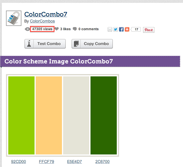
Color Combinations is part Wikipedia, with great search and clear organization, part content ranking  like Instagram  and devoted to color! The site, which was "built to help web developers quickly select and test web design colour combinations,"  has an endless array of sample palettes.  It is  a resource when in need  of color inspiration for anything from website to wedding.  You can also participate! Color Nerds Unite!

You can create color combinations using the sites tool and send combinations  out for the whole site to see. This format lets individuals practice thinking about color, and provides instant feedback from the  user group. Designers can test combos for their sites and bloggers can research the home page to see what is trending. 

Maybe sharing palettes isn't for you. You'd rather to look up a group of colors that would  fall generally under "amethyst." Color Combinations has colors grouped by hashtag, the same way all the #selfies are linked on Instagram.


The most popular palettes float to the top, essentially forecasting current opinions on color by the sites users. And with more and more color enthusiasts out there, artists, designers, architects, crafters,  are creating a large pool of color data preferences. Even if you're not inclined to make and share your own color palettes the trending colors on the front page give you an ability to track trends. Is the start of autumn (in the US) causing this spike in the rusted oranges to make the front page?

We do not promote selecting colors merely based on trend, but it is interesting to watch the collective unconscious of users start to reveal the trends.  This site can validate the traditional vehicles for color forecasting like CMG and the International Color Authority by opening up the audience to more than members only of their organizations.. 


The varied functionality and fantastic color tools of the library make this site a must for  color lovers.  Want to make a sweater with the colors from you favorite palette? What to quickly mashup colors on screen and play with combinations? What to think about color? Than Color Combinations is for you. 
Tuesday, October 1, 2013

Color Signatures and Classic Novels


When reading your favorite novel for the third time or approaching an intimidating classic have you  noticed how the authors create color portraits within their stories? Is that fictional world replete with moody blues and gray over cast skies or passionate reds with a dose of clean perfect white. What colors does the author gravitate toward and what colors are the most important to the characters in the story? 

One of the American Classics  famous for this type of color imagery is the Great Gatsby, shown above,  The green lantern beaming from the dock across the lake  becomes part of the story because its an object of minor obsession for the main character.  Gatsby's famous green is only a small part of the color picture of that novel but through the use of color data visualization  you can get the feel of the mood of the story.   

Fortunately for all us color lovers Jaz Parkinson, an artist with a great blog  on Tumblr, has been doing just that, constructing color signatures for well known novels that help reveal the color behind the story. Take this image The Wonderful Wizard of Oz, written by L. Frank Baum. 


As Jaz describes the pieces: "Each colour reference or piece of visual imagery in the novel has been tallied, graphed, and charted to make a unique signature for the book." So as we would expect ruby slippers, yellow brick road, and Emerald City  hues dominate this picture of of Oz but we also get to see the naked neutrals in the center and a blue purple sliver floating along the edge giving us clues to the less but perhaps more complex messages within  the story. If purple is only mentioned a few times perhaps it highlights a subtle but important part of the plot. 


The color signature for Cormac McCarthy's The Road, a brutal tale of apocalypse and survival, buries the thin filaments of green and blue, colors associated, at least in this context, with sustaining life, under a mountain of bleak gray scale topped with a bright vicious red. The color signature gives you visual, and because of our associations with color, emotional foundation out of which the story can emerge. There signatures are yet another great example of the power of color, evoking whole stories just from they colors they use. Brilliant!