Thursday, January 20, 2011

Color in Preschools + Elementary Schools: Part One


Photo by Jerry Levy


What are the best colors for Preschool and Elementary Grades? According to Frank Manhke, President of the International Association of Color Consultants, color in your environment has a psychophysiological influence on you. Manhke combines hard scientific evidence with empirical studies in his book, Color, Environment + Human Response.


Children are particularly susceptible to environmental stimulus. Different ages accept and reject colors according to their development. For young children, leaving the security of the home environment is challenging. Thus, creating a sense of security in their educational environment is very important.


Dr. Heinrich Frieling of the Institute of Color Psychology tested 10,000 children around the world on color preference. Here are some of his research findings:
  • Most children, ages five to fourteen rejected black, white, grey and brown.
  • Children five to eight preferred red, orange, yellow and violet.
  • Children nine to ten preferred red, red-orange and green-blue.
  • Children up to fourteen preferred blue, ultramarine and orange.
Dr. Frieling acknowledged that the pure hues noted above were not appropriate for large fields of color in the school environment. Manhke converted the color preference test results into suitable colors to be used as a palette guideline. As Manhke always stresses, color guidelines are simply guidelines, and not to be used as formulas. It's important to recognize that each school and classroom has different architectural conditions, light characteristics, geographic and cultural situations to evaluate.


Manhke recommends a warm bright color scheme of light salmon, warm yellow, pale yellow-orange, coral, and peach  These colors compliment the nature of young children and help reduce tension and anxiety. Colors from the cool spectrum, blues and blue-greens can balance the palette and work as accents. A balanced palette of warm and cool colors reduces tension, nervousness and anxiety. Colour Studio has always had a strong interest in coloring educational environments. For school projects we have incorporated warm yellows, blues, and greens. These colors were successful in lifting the general mood and atmosphere of the schools to positively impact the students and faculty. 


Colour Studio selected the following palette specifically for an elementary school located in Northern California. This palette was developed with the specific site in mind and is not intended to be used as a formula for all elementary schools. Here is a sampling of the colors we used:


Dunn Edwards 341

Benjamin Moore 148

Dunn Edwards 5332

Benjamin Moore HC-150

Benjamin Moore HC-143

Dunn Edwards 5879

The idea that young children need primary colors dominating their environment and visual stimuli covering every surface of a classroom is not supported by science. Incorporating too much color can be as detrimental as having too little color.


When considering color for schools, lets be sure to analyze each environment to insure our color and design decisions support the welfare of our end users no matter what their age.

Wednesday, January 19, 2011

Color Forecasting - Anticipating Public Taste


Color forecasting is based upon the idea that public taste can be anticipated. Whether it's due to current events or a natural oscillation, we see changes in the color forecast each year.


Pantone Mugs

Color Marketing Group produces forecasts for clients who pay large sums of money to be in the know. Pantone has determined it can raise its brand recognition by sharing its forecasts with the general public.

2011: Honeysuckle

Pantone 18-2120 – Cross Over: Benjamin Moore 2078-30

Pantone revealed Honeysuckle as the color of the year for 2011. Honeysuckle is a positive color that is found to be uplifting in a time of stress. As Leatrice Eisemen noted, “Honeysuckle is a captivating, stimulating color that gets the adrenaline going – perfect to ward off the blues.” (http://www.pantone.com/pages/pantone/pantone.aspx?pg=20821&ca=4)

We’ve taken a look back at the last 11 years and have found possible cross currents of events and color associations that inform each year’s color trends.

Here is a brief synopsis:

2000: Cerulean

Pantone 15-4020 – Cross Over: Benjamin Moore 822

Cerulean is a dreamy and peaceful color. This blue was chosen to be the color of 2000, the start of the millennium for it’s calming and peaceful attributes.

January 14: The Dow Jones Industrial Average closes at 11,722.98 (at the peak of the Dot-com bubble). The Dot-com era begins its decline and collapses.

November 7: Hillary Rodham Clinton is elected to the United States Senate, becoming the first First Lady of the United States to win public office.

2001: Fuchsia Rose

Pantone 17-2031 – Cross Over: Benjamin Moore 1349

2001, was the year that many of us remember as the Dot-com collapse and the tragedy of 9/11. The color Fuchsia Rose is optimistic and enlivening. This color was chosen wisely for 2001, as sadness was felt throughout the country.

2001: Multiple dot.com firms and online companies collapse.

January 20: George W. Bush in sworn in as the 43rd President of the United States.

September 11: 9/11 Attacks: The World Trade Center is hit.

2002: True Red

Pantone 19-1664 – Cross Over: Benjamin Moore 2087-10

The year following the attacks of 9/11 encouraged patriotism and building community. True Red inherently speaks to the country’s population as a color that is both energizing and patriotic.

April 19: The Senate defeats President Bush's plan to authorize oil exploration in the Arctic National Wildlife Refuge.

October 9 - October 10: Congress passes the Iraq Resolution authorizing the Iraq War.

2003: Aqua Sky

Pantone 14-4811 – Cross Over: Sherwin Williams 1750

Aqua Sky, the color of 2003 is comforting and soothing. The color Aqua reminds us of the sky and sea and is often associated with being an ‘escape color.’

March 20: The Iraq War begins.

June 4: Martha Stewart and her broker are indicted for using privileged investment information and obstructing a federal investigation.

September 17: President Bush admits that there is no evidence linking the Iraqi President Saddam Hussein to the September 11, 2001 attacks.

2004: Tiger Lily

Pantone 17-1456 – Cross Over: Benjamin Moore 021

Tiger Lily is a bold orange color that is energizing and stimulating. This orange is exotic and expresses a clear connection to the sun, signifying warmth.

February 3: The CIA admits that there was no imminent threat from weapons of mass destruction before the 2003 invasion of Iraq.

February 12: San Francisco begins issuing marriage licenses to same-sex couples.

July 25: Lance Armstrong wins the 6th consecutive Tour de France cycling title.

December 26: The Sumatra-Andaman earthquake occurs, resulting in the Indian Ocean tsunami. The devastating tsunami killed over 200,000 people and is one of the deadliest natural disasters recorded.

2005: Blue Turquoise

Pantone 15-5217 – Cross Over: Pittsburgh Paints 256-5

It’s only been a year, and we witness a return to another ‘escape color’ with Blue Turquoise as the color of the year for 2005. The serene qualities of Blue Turquoise seem fit for a year hit with a major and unsettling natural disaster.

January 20: George W. Bush is sworn in for his second term as president.

August 2005: Hurricane Katrina takes form on August 23rd and strikes the Gulf Coast on the 29th, causing severe damage and many deaths. On August 30th, Katrina disperses leaving many homeless and mourning the dead.

2006: Sand Dollar

Pantone 13-1106 – Cross Over: Benjamin Moore 1080
Sand Dollar is a neutral color, both calm and relaxing.

January 26: General Motors reports an $8.6 billion loss for 2005. This is their biggest loss since 1992.

November 6: Democrats gain control of both houses of the Congress. Nancy Pelosi becomes the first female Speaker of the House of Representatives.

2007: Chili Pepper

Pantone 19-1557 – Cross Over: Benjamin Moore 1322

Chili Pepper, the color of 2007 is outgoing and confident. This intense red color screams passion and is a color that cannot be ignored.

May 3: The U.S. House of Representatives passes the Matthew Shepard Act. This is the first time that a gay rights bill is brought to the floor for a vote.

August 7: Barry Bonds breaks Hank Aaron's home run record and hits his 756th home run.

October 9: The Dow Jones Industrial Average hits its all time high of 14,164 before beginning to decline into the recession.

December: The recession officially begins.

2008: Blue Iris

Pantone 18-3943 – Cross Over: Benjamin Moore 1407

Blue Iris is a rich color that has calming and spiritual effects. This stable color offers reassurance in a time of complexity and uncertainty.

January 21: Stock markets plunge amid growing fears of a U.S. recession.

November 4: Barack Obama is elected the 44th President of the United States and Joe Biden is elected the 47th Vice President. Barack Obama becomes the first African-American President-elect.

December 1: The Dow Jones Industrial Average drops 680 points. This is its fourth worst drop in its history.

2009: Mimosa

Pantone 14-0848 – Cross Over: Benjamin Moore 313

Mimosa, a golden yellow signifies warmth and nurturing. This color embodies hopefulness in a climate of change.

January 20: Barack Obama is inaugurated as the 44th President of the United States. More than one million people attend the inauguration service.

March 13: The Federal Reserve reports that U.S. families lost a record 18% of their wealth in 2008.

June 25: The great entertainer and musician Michael Jackson passes away and triggers an outpouring of worldwide grief.

2010: Turquoise

Pantone 15-5519 – Cross Over: Benjamin Moore 663

In 2010, we revisit another ‘escape color,’ Turquoise. The color turquoise offers a sense of protection and healing during stressful times.

April 20: An explosion occurs on the Deepwater Horizon oil rig. The explosion causes the rig to sink and initiates a massive offshore oil spill in the Gulf of Mexico. This is the largest environmental disaster in U.S. history.

November 4: The US Federal Reserve announces that they will buy $600 billion in bonds to encourage economic growth.

November 9: San Francisco bans Happy Meal, served by McDonald's with regard to growing obesity concern.

November 28: WikiLeaks publicly releases thousands of confidential documents from the U.S. government.


Whirlpool Duet, 2009

We can be certain the 2012 forecast will introduce us to a new hue. People are fickle about color and color does not age well in our society. Both Color Marketing Group and Pantone will continue to influence the industries of apparel, automotive and product. Without new trends, people might not invest in that new outfit, the turquoise espresso machine, or the cranberry matching washer and dryer combo. Color Sells.
Friday, November 5, 2010

A Colorful Addition to Any Wardrobe - The Bow Tie

Photo: Mr. P_Laurent Desgrange Ties


My friend Kenneth has encouraged me to do more blogging. Everyday there is something color related that strikes a chord and then I think its not academic enough to blog about. But I will confess, not all of my color interests are purely academic. Some of them are emotionally driven.


I have friends who are more color sensitive than others. I have found connecting with friends on a deep level takes many forms. It could be in the frequency of our communications or in the number of times we see each other per month. I however, have another barometer - the ease of buying them colorful gifts. I believe that knowing what someone will genuinely appreciate as a gift is a true measure of friendship.


Two years ago in Manhattan, wandering Museum Mile on the Upper East Side, my daughter Emerald and I stumbled across the Seigo Neckwear store at 1248 Madison Avenue at 90th Street. The small shop with its colorful display of beautiful ties in the window drew us right in. Not only did they have fantastic ties, silk scarves, pocket squares and handkerchiefs, they had a complete wall display of hard to find bow ties.


Photo: Seigo Shop

Immediately I know which friend of mine would love one of these ties as a gift.


Photo: Seigo Katsuragawa

The shop owner, Seigo Katsuragawa came to New York 20 years ago to study at FIT. He has all of his ties woven in Japan with looms typically used to produce fine kimono fabrics. Many of his ties have a unique matte finishes and offer unusual color combinations and patterns which are unique to the tie market.

On this visit I found a delicate yellow floral print and a vintage 1950's pink and brown graphic which I knew would be a welcome addition to my friend's collection.


Here is my colorful friend modeling last years birthday gifts from Seigo.


You can see his careful coordination of shirt and tie. The perfect gift of friendship. Colorful and unique, just like the gift recipient.

Wednesday, October 20, 2010

The Community of the Future is Filled with Color

This month I participated in a think tank salon hosted and moderated by Deborah Patton Executive Director of The Center for Applied Brilliance. The venue was the West Coast Green Conference 2010. Marc Hinshaw, architect, Jerry Michalski, relationship economy expert and Susan Goltsman, planner and landscape architect, joined me on the panel. We each were asked to develop our presentations around the idea of The Future of Community. The panel did not communicate prior to the presentation yet the amount of agreement in our perceptions of the future was synergistic.

Images: Architect Will Alsop's designs for his City of the Future Vancouver, Canada


I started research on color and architecture. I found myself online looking at images from Europe and Asia of both environmentally responsible and colorful architecture. Why are other cultures so much more willing to use color on buildings than we are?

Image: Low2No ARUP with Sauerbruch and Hutton. Winning design to develop the 1st carbon neutral development in Helsinki, Finland


Is there a fear of color in our culture? I believe there is. An excellent book supporting this argument is Chromophobia, by David Batchelor. Batchelor defines the principle of chromophobia as a fear of corruption or contamination through color that has lurked in Western culture since ancient times. He argues that chromophobia is apparent in the many attempts to purge color from art, literature, and architecture either by making it the property of some foreign body, the oriental, the feminine, the infantile, the vulgar or the pathological or by relegating it to the realm of the superficial, the inessential, the cosmetic.


Image: Chromaphobia by David Batchelor


Additionally, negative color statements have been made by people who are Icons in our field.

Even though Corbusier only produced one all white building, he is historically known for his crusade for white.

Image: Corbusier in his studio


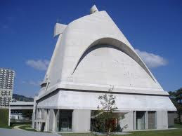
Image: Corbusier design for a chapel in Rome


Richard Meier typically produces all white buildings and is a crusader for white.

Image: Richard Meier


Image: Jubilee Church in Rome, Italy


Image: The Getty Museum in Los Angeles California


As we become more global in all aspects of our experience, I predict the fear of color in architecture may shift.


Image: Photographer - Jerry Levy


With dwindling resources, and tight budgets, we have to rethink the materials and finishes we have available for construction. Color has the ability to trigger responses, and communicate volume, form, scale and detail. Color is in a position to assert itself as a viable tool to articulate architecture.

Image: Herzog and Demeuron highrise in Beijing, China

I remain optimistic that color will be used as a resource in the creation of spaces that have both sensual character and memorable qualities.

Image: Sauerbrach and Hutton - Highbay Warehouse for Sedus in the Black Forest

I will crusade for color !

Friday, July 16, 2010

Economical & Cheerful

We recently completed a color project for UCSF at the Parnassus Campus in San Francisco. The facility built on land donated to the University by Adolph Sutro was constructed in stages. The Clinical Sciences Building went up in 1934, The Moffit Hospital designed by Timothy Pflueger and the Medical Sciences building opened in 1955. The School of Nursing was completed in 1972, and the Health Sciences East and West opened in 1975. The buildings have been added to, reconfigured, and linked over 30 years. Students and visitors find navigating the Campus challenging.

Parnassus Campus Map

Facing extremely tight budgets for improvements and maintenence, the Facilities department commissioned Colour Studio to create a color palette for the 10 plus miles of corridors linking Medical Sciences, Clinical Sciences and the Health Sciences East and West.

Our mission was to aid way finding, create a palette to differentiate buildings, and appeal to a broad number of personal tastes.

Upon completion of the painting, we received several emails from the users. In fact the first compliments that came in were addressing one of the most challenged spaces, the windowless, basement hallways of the Medical Sciences.

Subject: RE: MSB Basement Paint

“It really opens up the basement and makes it look bigger than ever. Nice and soothing.”

“We love the new paint colors in the basement level of MSB!”

The UCSF Corridor Project had no architectural improvements, and no lighting enhancements. The application of a sunny color palette did radically change the experience of the hallway.

You can’t afford to ignore the value add of color – it can transform a users experience.

BEFORE


AFTER

Thursday, March 25, 2010

"Color Icons" Mary Blair

Last week I went to the Walt Disney Family Museum located in The Presidio of San Francisco. The personal evolution of Walt Disney and the Disney Studios is chronicled in amazingly creative interactive displays. I was delighted to discover the sophisticated color work of one of his key collaborators, Mary Blair.

Image: The Colors of Mary Blair, Walt Disney Animation Research Library Collection

Mary Blair was born into a poor family in Oklahoma in 1911, moving first to Texas and then west to San Jose, California when she was 7. Blair's artistic skills were evident at a very early age. Her mother supported the family by sewing for the neighbors as well as for the local churches. With remnants, clothes were fashioned for Blair that according to biographers were both colorful and stylish.

Image: Cartoon Modern – www.cartoonmodern.blogsome.com

Blair won an art scholarship to Chouinard Art Institute in Los Angeles . She graduated at the height of the Depression in 1933. The economic climate forced her to abandon her dream of a fine arts career. She took a job in the animation unit at MGM Studios. She married an artist and continued to develop her color eye. Blair started using her fine arts training to inform her work in animation.

In 1940, Disney recruited Blair where she worked under the title of color stylist and designer for 30 years. Her collaborators described her exciting use of color on a par with Matisse. She painted color compositions using complex tertiary hues. She would place two different chromatic intensities of color next to one another which was revolutionary for animation at that time.

Image: The Art and Flair of Mary Blair, John Canemaker – Disney Editions

Her inventive palettes of muddy colors with pure colors created a visual tension that heightened the sense of drama. Her Peter Pan and Cinderella colorations shaped the future of Disney animated features.

Image: Cartoon Modern – www.cartoonmodern.blogsome.com

Disney asked her to create the character design of It’s a Small World, for the 1964-65 New York World’s Fair.

Image: The Art and Flair of Mary Blair, John Canemaker – Disney Editions

After she left Disney, she continued to apply her original and distinctive color skills to free lance mural design, graphic design and the illustration of children’s books.

To give you an insight into Blair’s character, here are two excerpts I found.

Joyce Carson who worked with Mary Blair was interviewed by Disney Historian Jim Korkis.

“Mary sewed and designed her own distinctively stylish, color coordinated clothes. She had lots of glasses and a lot of different colored contact lenses as well. She used to coordinate her eyewear to go with the outfit she was wearing that day."

John Canemaker, tenured professor and director of the film animation program at New York University’s Tisch School of the Arts, authored The Flair of Mary Blair. “Blair juggled her family and creative life. She postponed starting a family until she was thirty six. Even after the birth of her second child three and a half years later, Mrs. Blair continued create dazzling color compositions.”

Image: Cartoon Modern – www.cartoonmodern.blogsome.com

Blair died in 1978. She was the very first woman to be honored as a Disney Legend. I would like to think she will be remembered for her prolific and joyful creativity, her exuberant color palette, and her pioneering spirit as a woman in the arts.

Image: The Art and Flair of Mary Blair, John Canemaker – Disney Editions

The Colors of Mary Blair

Walt Disney Animation Research Library Collection

The Art and Flair of Mary Blair

John Canemaker – Disney Editions

Cartoon Modern – www.cartoonmodern.blogsome.com

Disney Legends – www.legends.disney.go.com