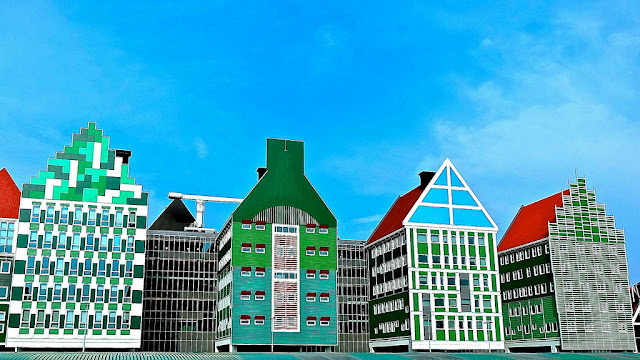
Few new buildings bring with them dramatic feelings of both wonder and consternation quite like the newly opened Inntell Hotel in Zaandam, the Netherlands. It is either a beautiful and well thought out conceptual building or an over textural eyesore depending on who is looking at it. Boasting 160 rooms over 11 stories, the hotels appears to be composed of stacked up, interlocking wooden houses traditional to the region.
The various gables lead to roofs below windows or next to cornices and false fronts. It is a maze of old world architecture reworked for modern eyes accustomed to the fast pace of visual information. It is a building that has to be sorted out by the eye not just consumed. And the color choices for the building make the architectural illusion all the more remarkable. Colored in greens and green-grays with a focal spot of high chroma bright blue, the individual homes seem to melt together in to a truly cohesive whole.
While it may seem to stand out, perhaps an example of overzealous maximalism, when taken in consideration with the Zaandam area, the building seems to fit right in. "I didn't set out to shock," said Wilfried van Winden, chief architect of WAM, the firm behind the creation of the Inntell Hotel. "But this is, of course, an outspoken building. And the language it speaks is the architectural language of Zaanstad. It makes a big statement, sure, but the building is not an imposition – it belongs here." After a little looking around we found this image of the Zaandam City Hall.
 |
| Via Ken Lee |
When viewed in context of these government buildings from the region, the Inntell Hotel seems more the colorful eye-catching product of a colorful eye-catching and frankly architecturally adventurous place, than the sore thumb some have accused it of being. Buildings and their color and design choices can not be judged by one photograph from one angle but instead need to bee seen in the context of their geographic location and their neighbors.
What do you think? Does Zaandam seem like a place you'd like to live or is this outcropping of creativity too much for your everyday eyes? Want to read more about the stacking trend in architecture? This 'Stacking in style' piece at the Web Urbanist is a good introduction.
- Emily Eifler, Writer, Colour Studio
- Jill Pilaroscia, Principal, Colour Studio


No comments:
Post a Comment