Friday, November 5, 2010

A Colorful Addition to Any Wardrobe - The Bow Tie

Photo: Mr. P_Laurent Desgrange Ties


My friend Kenneth has encouraged me to do more blogging. Everyday there is something color related that strikes a chord and then I think its not academic enough to blog about. But I will confess, not all of my color interests are purely academic. Some of them are emotionally driven.


I have friends who are more color sensitive than others. I have found connecting with friends on a deep level takes many forms. It could be in the frequency of our communications or in the number of times we see each other per month. I however, have another barometer - the ease of buying them colorful gifts. I believe that knowing what someone will genuinely appreciate as a gift is a true measure of friendship.


Two years ago in Manhattan, wandering Museum Mile on the Upper East Side, my daughter Emerald and I stumbled across the Seigo Neckwear store at 1248 Madison Avenue at 90th Street. The small shop with its colorful display of beautiful ties in the window drew us right in. Not only did they have fantastic ties, silk scarves, pocket squares and handkerchiefs, they had a complete wall display of hard to find bow ties.


Photo: Seigo Shop

Immediately I know which friend of mine would love one of these ties as a gift.


Photo: Seigo Katsuragawa

The shop owner, Seigo Katsuragawa came to New York 20 years ago to study at FIT. He has all of his ties woven in Japan with looms typically used to produce fine kimono fabrics. Many of his ties have a unique matte finishes and offer unusual color combinations and patterns which are unique to the tie market.

On this visit I found a delicate yellow floral print and a vintage 1950's pink and brown graphic which I knew would be a welcome addition to my friend's collection.


Here is my colorful friend modeling last years birthday gifts from Seigo.


You can see his careful coordination of shirt and tie. The perfect gift of friendship. Colorful and unique, just like the gift recipient.

Wednesday, October 20, 2010

The Community of the Future is Filled with Color

This month I participated in a think tank salon hosted and moderated by Deborah Patton Executive Director of The Center for Applied Brilliance. The venue was the West Coast Green Conference 2010. Marc Hinshaw, architect, Jerry Michalski, relationship economy expert and Susan Goltsman, planner and landscape architect, joined me on the panel. We each were asked to develop our presentations around the idea of The Future of Community. The panel did not communicate prior to the presentation yet the amount of agreement in our perceptions of the future was synergistic.

Images: Architect Will Alsop's designs for his City of the Future Vancouver, Canada


I started research on color and architecture. I found myself online looking at images from Europe and Asia of both environmentally responsible and colorful architecture. Why are other cultures so much more willing to use color on buildings than we are?

Image: Low2No ARUP with Sauerbruch and Hutton. Winning design to develop the 1st carbon neutral development in Helsinki, Finland


Is there a fear of color in our culture? I believe there is. An excellent book supporting this argument is Chromophobia, by David Batchelor. Batchelor defines the principle of chromophobia as a fear of corruption or contamination through color that has lurked in Western culture since ancient times. He argues that chromophobia is apparent in the many attempts to purge color from art, literature, and architecture either by making it the property of some foreign body, the oriental, the feminine, the infantile, the vulgar or the pathological or by relegating it to the realm of the superficial, the inessential, the cosmetic.


Image: Chromaphobia by David Batchelor


Additionally, negative color statements have been made by people who are Icons in our field.

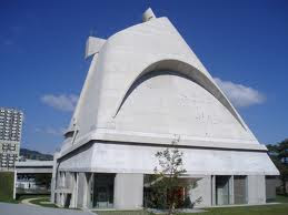
Even though Corbusier only produced one all white building, he is historically known for his crusade for white.

Image: Corbusier in his studio


Image: Corbusier design for a chapel in Rome


Richard Meier typically produces all white buildings and is a crusader for white.

Image: Richard Meier


Image: Jubilee Church in Rome, Italy


Image: The Getty Museum in Los Angeles California


As we become more global in all aspects of our experience, I predict the fear of color in architecture may shift.


Image: Photographer - Jerry Levy


With dwindling resources, and tight budgets, we have to rethink the materials and finishes we have available for construction. Color has the ability to trigger responses, and communicate volume, form, scale and detail. Color is in a position to assert itself as a viable tool to articulate architecture.

Image: Herzog and Demeuron highrise in Beijing, China

I remain optimistic that color will be used as a resource in the creation of spaces that have both sensual character and memorable qualities.

Image: Sauerbrach and Hutton - Highbay Warehouse for Sedus in the Black Forest

I will crusade for color !

Friday, July 16, 2010

Economical & Cheerful

We recently completed a color project for UCSF at the Parnassus Campus in San Francisco. The facility built on land donated to the University by Adolph Sutro was constructed in stages. The Clinical Sciences Building went up in 1934, The Moffit Hospital designed by Timothy Pflueger and the Medical Sciences building opened in 1955. The School of Nursing was completed in 1972, and the Health Sciences East and West opened in 1975. The buildings have been added to, reconfigured, and linked over 30 years. Students and visitors find navigating the Campus challenging.

Parnassus Campus Map

Facing extremely tight budgets for improvements and maintenence, the Facilities department commissioned Colour Studio to create a color palette for the 10 plus miles of corridors linking Medical Sciences, Clinical Sciences and the Health Sciences East and West.

Our mission was to aid way finding, create a palette to differentiate buildings, and appeal to a broad number of personal tastes.

Upon completion of the painting, we received several emails from the users. In fact the first compliments that came in were addressing one of the most challenged spaces, the windowless, basement hallways of the Medical Sciences.

Subject: RE: MSB Basement Paint

“It really opens up the basement and makes it look bigger than ever. Nice and soothing.”

“We love the new paint colors in the basement level of MSB!”

The UCSF Corridor Project had no architectural improvements, and no lighting enhancements. The application of a sunny color palette did radically change the experience of the hallway.

You can’t afford to ignore the value add of color – it can transform a users experience.

BEFORE


AFTER

Thursday, March 25, 2010

"Color Icons" Mary Blair

Last week I went to the Walt Disney Family Museum located in The Presidio of San Francisco. The personal evolution of Walt Disney and the Disney Studios is chronicled in amazingly creative interactive displays. I was delighted to discover the sophisticated color work of one of his key collaborators, Mary Blair.

Image: The Colors of Mary Blair, Walt Disney Animation Research Library Collection

Mary Blair was born into a poor family in Oklahoma in 1911, moving first to Texas and then west to San Jose, California when she was 7. Blair's artistic skills were evident at a very early age. Her mother supported the family by sewing for the neighbors as well as for the local churches. With remnants, clothes were fashioned for Blair that according to biographers were both colorful and stylish.

Image: Cartoon Modern – www.cartoonmodern.blogsome.com

Blair won an art scholarship to Chouinard Art Institute in Los Angeles . She graduated at the height of the Depression in 1933. The economic climate forced her to abandon her dream of a fine arts career. She took a job in the animation unit at MGM Studios. She married an artist and continued to develop her color eye. Blair started using her fine arts training to inform her work in animation.

In 1940, Disney recruited Blair where she worked under the title of color stylist and designer for 30 years. Her collaborators described her exciting use of color on a par with Matisse. She painted color compositions using complex tertiary hues. She would place two different chromatic intensities of color next to one another which was revolutionary for animation at that time.

Image: The Art and Flair of Mary Blair, John Canemaker – Disney Editions

Her inventive palettes of muddy colors with pure colors created a visual tension that heightened the sense of drama. Her Peter Pan and Cinderella colorations shaped the future of Disney animated features.

Image: Cartoon Modern – www.cartoonmodern.blogsome.com

Disney asked her to create the character design of It’s a Small World, for the 1964-65 New York World’s Fair.

Image: The Art and Flair of Mary Blair, John Canemaker – Disney Editions

After she left Disney, she continued to apply her original and distinctive color skills to free lance mural design, graphic design and the illustration of children’s books.

To give you an insight into Blair’s character, here are two excerpts I found.

Joyce Carson who worked with Mary Blair was interviewed by Disney Historian Jim Korkis.

“Mary sewed and designed her own distinctively stylish, color coordinated clothes. She had lots of glasses and a lot of different colored contact lenses as well. She used to coordinate her eyewear to go with the outfit she was wearing that day."

John Canemaker, tenured professor and director of the film animation program at New York University’s Tisch School of the Arts, authored The Flair of Mary Blair. “Blair juggled her family and creative life. She postponed starting a family until she was thirty six. Even after the birth of her second child three and a half years later, Mrs. Blair continued create dazzling color compositions.”

Image: Cartoon Modern – www.cartoonmodern.blogsome.com

Blair died in 1978. She was the very first woman to be honored as a Disney Legend. I would like to think she will be remembered for her prolific and joyful creativity, her exuberant color palette, and her pioneering spirit as a woman in the arts.

Image: The Art and Flair of Mary Blair, John Canemaker – Disney Editions

The Colors of Mary Blair

Walt Disney Animation Research Library Collection

The Art and Flair of Mary Blair

John Canemaker – Disney Editions

Cartoon Modern – www.cartoonmodern.blogsome.com

Disney Legends – www.legends.disney.go.com

Friday, March 19, 2010

"Color Icons" Diana Vreeland

Emerald Carroll, our new associate in Manhattan, suggested I start a series of blog posts on “Color Icons”. With such a colorful name, I decided to follow her advice.

The “Color Icons” posts will be featuring individuals who have left their mark on the world due to their specific interest, passion, research, and writings on color. I am starting the series with Diana Vreeland, a woman of exceptional personal style and a deep love for the color red.

Image: Diana's Dining Room

Diana Vreeland fascinated me from the moment I saw her rebellious “youthquake” mini skirted models featured in Vogue in the 60’s. She was the fashion editor of Harper’s Bazaar from 1937 to 1962. In 1962 she left Harpers to become editor in chief of Vogue. She built a reputation for allowing photographers, stylists and models to do what they do best - be creative. In 1972 she was fired from Vogue for being a troublesome perfectionist.

Image: Vogue Covers

She is described as having an incredible aura of glamour, and a startling personal style. She oozed enthusiasm, vitality and pizzazz and could hold an audience captive with her provocative and fantastic stories.

Image: Diana at Black Tie Event

She consciously matched her personality with her environments, surrounding herself with dynamic and powerful red.

She worked out of a red lacquered office, smoked constantly, ate peanut butter and jelly for lunch and chased it down with a shot of scotch.

Diana’s friend Horst P. Horst photographed her in her living room designed by Billy Baldwin. Diana referred to the room as her “Garden In Hell.”

Image: Diana in "Garden In Hell" Living Room

Diana is quoted as stating “ All my life I’ve pursued the perfect red. I can never get painters to mix it for me. I want Rococo with a spot of Gothic in it and a bit of Buddhist Temple.”

She embraced red in all forms - red walls, sofas, pillows, and chairs. She surrounded herself with large vases of red flowers and would only pen her notes with red ink. She was frequently photographed dressed head to toe in the hue.

Diana went on to establish her own job title at the Metropolitan Museum of Art as the ‘special consultant’ to the Museum’s Costume Institute. She staged nine fantastic shows including Costumes and Designs of the Ballet Russes, The World of Balenciaga, and Romantic and Glamorous Hollywood Design.

When Vreeland became blind in the mid 1980’s she stated it was because she had looked at so many beautiful things. I can only imagine she still saw the world through a red lens.

Vreeland, a style icon of historic proportion fully realized the power of color. Diana died in1989.

Image: Diana at the Metropolitan Costume Institute

Credits:

Diana Vreeland

By Eleanor Dwight

William Morrow an Imprint of Harper Collins Publishers


Diana Vreeland

By Diana Vreeland

Alfred A. Knopf Publisher

Wednesday, February 24, 2010

Red, the Color of Attraction - Color Science Meets the Movies

Two researchers, Andrew Elliot, a psychology professor, and Daniela Niesta, a postdoctoral researcher, at the University of Rochester, published a groundbreaking study in the Journal of Personality and Social Psychology. Using five psychological experiments, the study concluded the color red makes men feel more amorous toward women. And men are unaware of the role color plays in their attraction.


Image Source: Head In The Clouds (2004)


“Much is known about color physics and color physiology, but very little is known about color psychology, “ said Elliot.

The aphrodisiacal association of red with amorous intentions my be a societal conditioning, consider the red light district and the red hearts and roses associated with Valentines.


Image: Jerry Levy

Elliot & Niesta argue that men’s response to red may more likely stem from deep biological roots. Non-human primates respond to females displaying red. When nearing ovulation, female baboon and chimpanzees redden conspicuously nearing ovulation. This sends a clear color signal to attract males. As much as men might think they respond to women in a thoughtful, controlled way, the study shows their preferences and predilections are more primitive.

Image Source: Volver (2006)

To quantify the red effect, one study looked at men’s responses to photographs of women under a variety of color presentations. A woman’s photo would be framed by blue, white, gray or red. In another experiment the woman’s photo was placed on a red or blue background.


Image Source

In one study, men were shown photographs of women wearing either a red or blue shirt. In the experiment men were asked not only about their attraction to the woman, but if they were going on a date and had $ 100.00 in their wallet, how much money would you be willing to spend on your date?

Image Source: Far From Heaven (2002)

Under all conditions, women shown framed by or wearing red were rated significantly more attractive and sexually desirable by men than the exact same woman shown with other colors.

Story Source: University of Rochester(2008, October 28.) Red Enhances Men’s Attraction To women, Psychological Study Reveals. Science Daily. Retrieved February 15, 2010, from http://www.sciencedaily.com/releases/2008/10/081028074323.htm

Forever trying to raise the awareness that color matters in all areas of our lives, I recently saw Pedro Almodovar’s movie, Broken Embraces. The amount of red in the movie was striking. I found an interview on line with Maria Delgado and Almodovar discussing the color.

Image Source: Volver (2006)

Maria Delgado: I’m very aware that in all your films, quite often the strong female character is seen wearing red at specific points in the film. So whenever I watch one of your films, I almost wait for it – to see a red dress, or red cardigan or red shoe. It’s like a treasure almost. Is that intentional or is that just me?

Pedro Almodovar: The color red is present in all my films and my films are on the whole are very colorful. I use it in a very sensual way - It is a significant color. In Spain it represents hate, love and fire. It’s a cross- cultural color of humanity.

Story Source: http://moviegrande.com/volver/interview5.htm

Wednesday, February 17, 2010

Color Psychology & Big Pharma

Since starting the blog, I have been spending more time on the web searching for research articles on applied color. Its remarkable how many articles are written about color and the pivotal role it plays in our lives.


Wired Magazine ran an article last fall, Placebos Are Getting More Effective. Drug makers Are Desperate to Know Why. "What turns a dummy pill into a catalyst for relieving pain, anxiety, depression, sexual dysfunction, or the tremors of Parkinson’s disease? It is the brain’s own healing mechanisms, unleashed by the belief that a phony medication is the real thing. The most important ingredient in any placebo is the doctor’s bedside manner followed by the color or the tablets." – Steve Silberman


Yellow pills make for the most effective antidepressants as they are seen as little doses of sunshine. Red pills are most stimulating and provide energy while soothing blue works best for tranquilizers. Green pills reduce anxiety and white tablets are superior for soothing ulcers.

Color association and symbolism provided the basis for the development of the field of color psychology. To see the influence of color penetrate into big Pharma’s attempt to dominate our central nervous system demonstrates how powerful the brain is and that color has a definitive impact on human experience.

Author: Jill Pilaroscia, Colour Studio, Life In Color


Friday, February 5, 2010

Color In The Office Environment

Do office workers benefit from the use of color in their environments?

Image: Red Envelope Office_David Wakely

If you ask the workers you will typically get a positive response. If you ask facilities management you may get a negative answer. If you ask the architects and designers you will get a mixed answer.

Why is this?

Every individual has subjective color likes and dislikes. If the office is designed using a workers preferred colors they tend to like their environment. Conversely if they hate a certain color and must work surrounded by it everyday, you know they will find it irritating.

Image: The Art Of Color_Johanes Itten

From a facilities management perspective, the typical objection to color is the extra work it takes to maintain an office with multiple hues. The time required to clean paintbrushes and paint buckets when several colors are involved translate to department costs.

Architects and designers may frown upon applied colors and believe that color should come from the building materials themselves.

I do not disagree at all with this belief. However, budget driven projects will use special materials in public spaces like the Lobby, Conference and Board Rooms. The open office may not have the budget for special materials.

Image: HP Lobby_Sharon Reisdorf

This is where paint and color can come in to make the work place more appealing.

Is there science behind the application of color to office environments?

Frank Mahnke in his book Color Environment and Human Response outlines a solid body of research supporting the value of color. Citing psycho-physiological, neuro physiological, psychosomatic and visual ergonomic factors, color and light can greatly improve a person’s impression of their workplace. We respond to color in a complex way that operates beyond personal preference. Lack of stimulation whether visual or psychological is associated with boredom, and fatigue.

Image: Cafeteria_David Wakely

By consciously varying the light dark contrasts and using a well rounded palette you can imitate the range of colors one would experience in nature. You also increase the chances of creating a pleasing environment that may appeal of a broad group of end users.

There is no specific formula of colors for an office that can be prescribed. Each office needs to be carefully evaluated to determine its optimal palette. There is ample research in cross-disciplinary fields to support the fact that color can play an important role in the office environment.

Color, Environment & Human Response
Frank H. Mahnke


Color Planning for Interiors

Margaret Portillo