Saturday, October 12, 2013

Color Combinations: A site for Color Nerds.

Color Combinations
If you've been on the internet lately you see an abundance of color.  With striking imagery everywhere,  presenting feeds of richly colored Instagram images, endless HD videos, and tumblr gif collages, social networks are packed with color.  What resources can a color nerd to go to remix and share all that color: Color Combinations!
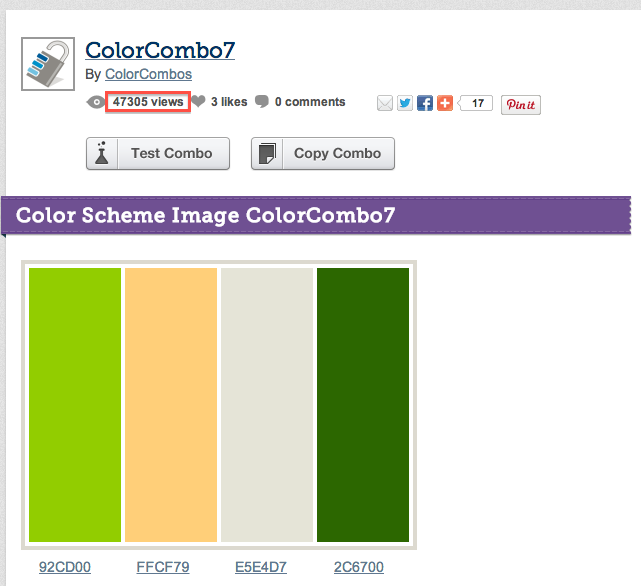

Color Combinations is part Wikipedia, with great search and clear organization, part content ranking  like Instagram  and devoted to color! The site, which was "built to help web developers quickly select and test web design colour combinations,"  has an endless array of sample palettes.  It is  a resource when in need  of color inspiration for anything from website to wedding.  You can also participate! Color Nerds Unite!

You can create color combinations using the sites tool and send combinations  out for the whole site to see. This format lets individuals practice thinking about color, and provides instant feedback from the  user group. Designers can test combos for their sites and bloggers can research the home page to see what is trending. 

Maybe sharing palettes isn't for you. You'd rather to look up a group of colors that would  fall generally under "amethyst." Color Combinations has colors grouped by hashtag, the same way all the #selfies are linked on Instagram.


The most popular palettes float to the top, essentially forecasting current opinions on color by the sites users. And with more and more color enthusiasts out there, artists, designers, architects, crafters,  are creating a large pool of color data preferences. Even if you're not inclined to make and share your own color palettes the trending colors on the front page give you an ability to track trends. Is the start of autumn (in the US) causing this spike in the rusted oranges to make the front page?

We do not promote selecting colors merely based on trend, but it is interesting to watch the collective unconscious of users start to reveal the trends.  This site can validate the traditional vehicles for color forecasting like CMG and the International Color Authority by opening up the audience to more than members only of their organizations.. 


The varied functionality and fantastic color tools of the library make this site a must for  color lovers.  Want to make a sweater with the colors from you favorite palette? What to quickly mashup colors on screen and play with combinations? What to think about color? Than Color Combinations is for you. 

Tuesday, October 1, 2013

Color Signatures and Classic Novels


When reading your favorite novel for the third time or approaching an intimidating classic have you  noticed how the authors create color portraits within their stories? Is that fictional world replete with moody blues and gray over cast skies or passionate reds with a dose of clean perfect white. What colors does the author gravitate toward and what colors are the most important to the characters in the story? 

One of the American Classics  famous for this type of color imagery is the Great Gatsby, shown above,  The green lantern beaming from the dock across the lake  becomes part of the story because its an object of minor obsession for the main character.  Gatsby's famous green is only a small part of the color picture of that novel but through the use of color data visualization  you can get the feel of the mood of the story.   

Fortunately for all us color lovers Jaz Parkinson, an artist with a great blog  on Tumblr, has been doing just that, constructing color signatures for well known novels that help reveal the color behind the story. Take this image The Wonderful Wizard of Oz, written by L. Frank Baum. 


As Jaz describes the pieces: "Each colour reference or piece of visual imagery in the novel has been tallied, graphed, and charted to make a unique signature for the book." So as we would expect ruby slippers, yellow brick road, and Emerald City  hues dominate this picture of of Oz but we also get to see the naked neutrals in the center and a blue purple sliver floating along the edge giving us clues to the less but perhaps more complex messages within  the story. If purple is only mentioned a few times perhaps it highlights a subtle but important part of the plot. 


The color signature for Cormac McCarthy's The Road, a brutal tale of apocalypse and survival, buries the thin filaments of green and blue, colors associated, at least in this context, with sustaining life, under a mountain of bleak gray scale topped with a bright vicious red. The color signature gives you visual, and because of our associations with color, emotional foundation out of which the story can emerge. There signatures are yet another great example of the power of color, evoking whole stories just from they colors they use. Brilliant! 

Tuesday, September 24, 2013

Color Icon: San Francisco Contemporary Jewish Museum

This weeks post from Colour Studio features one of our favorite San Francisco icons.  In this aerial view, we can see  buildings of varying architectural styles nestled on a block.   One building in particular stands out as a color icon: the San Francisco Contemporary Jewish Museum!

The museum, whose tag line is "connecting art, people and ideas," explores the history, art, and spirituality of the Jewish community today. The building is tucked among the footprints of giant skyscrapers, malls, hotels and historic St. Patrick's Catholic Church.  The museum designed by Daniel Libeskind  melds the historical 1907 brick building, originally the Jessie street power substation, with a dark blue stainless steel addition completed in 2008. This visual juxtaposition of new and old, steel and brick, earth tone and metallic finish might have been jarring but this building feels whole when taken in context with its contemporary glass and steel surroundings. 


The shape of the extension, using the architects characteristic angular shapes is clad in metal tiles.    The form was inspired by the Hebrew letters “chet” and “yud,” both used to spell “L’Chaim,” meaning “To Life”.   The prominent solid color of the extension is as important as the shapes themselves. The opalescent blue colors  selected  are often associated with depth and stability, wide night skies, still ocean waters. 


The color, which has been shown to slow our metabolisms, heart rates, and produce an over all calming effect, seems glacial, like a solid block of cooled tempers emanating tranquil cold into the hyperactive city life surrounding it.   And this is part of what makes this museum a color icon. This building is a clear example that color should never be thought of as mere decoration, chosen purely by personal preference. 

Color, if carefully and thoughtfully chosen, broadcasts meaning to those in the vicinity of the building. A combination of the extension association with a call "To Life!" and the deep blue color can easily be seen as a political or social statement, a call for compromise, levelheadedness, or forethought. In a heated world, the San Francisco Contemporary Jewish Museum asks its visitors to take a deep breath, and not let things get out of hand. Color has the power to change us, our bodies and our minds, and here is a community using color for peace. 

All images via Studio Daniel Libeskind

Monday, September 16, 2013

Color inspiration: Jack Laurilla

Part of .doc series (2013)
After last weeks exploration of color with icon Dale Chihuly, this week we want to introduce you to an up and coming individual using color to explore the language of visual media online: Jack Laurilla. Laurilla is an artist on Tumblr working with images found online.   He remakes them into pure color portraits or creates woven blanket or rug like color-scapes with incongruous software like Microsoft Word.

Word, a common place software, is meant for word processing. If you use a computer in everyday life,  you likely know how to use Word or a similar program to whip out a document full of words. We use processing programs for everything from invoices and business contracts to novels and daily diaries.

Part of .doc series (2013)
Laurilla on the other hand uses that same program to construct documents of color. Using a simple combination of text and highlight color in Word he paints intricate repeating patterns that ask the reader/viewer to see both the whole field of color, the story with all its characters and plot lines, as well as the minute pieces, individual letters and punctuation marks. The images challenge our linguistic separation between document, the visual storage of words, and image, the visual storage of shape and color. Why not read color left to right line by line the way we might read a book or email? 

Part of .doc series (2013)
As he states on his site,  in his work "representation and realism is abandoned in favour of the newly created vocabulary of colour." But what does "vocabulary of colour" mean? Lets look at this red and blue piece from Laurilla's .doc series. One way to think about a new color vocabulary would be to look at this document as though asked what if "vocal" and "eight" (just as two examples of five letter words with no repeating characters) were spelled with five shades of red and five shades of blue instead of letters at all. If we read in color this page could read:

vocaleightvocaleightvocaleightvocaleightvocaleight
eightvocaleightvocaleightvocaleightvocaleightvocal
vocaleightvocaleightvocaleightvocaleightvocaleight
eightvocaleightvocaleightvocaleightvocaleightvocal

How differently we would see our world if our languages were made up of colors instead of characters! 


Monday, September 9, 2013

Color Icon: Dale Chihuly


If ever there was an artist known for working with color it's Dale Chihuly. His wild, extravagant sculptures push the limits of glass, that material we think of as fragile but utilitarian, until it seems weightless and plastic. Born in 1941 Chihuly is an American glass sculptor who has spent years exploring, teaching, and expanding the field of glass sculpture. He studied art, sculpture and interior design before, in 1968, heading off to Venice to study glass as a Fulbright fellow.


He continued to  blow glass himself even after a car accident left him blind in one eye.  He was injured by  his pet material when he flew through the  car windshield.   Years later a shoulder injury left him unable to manage the equipment and he had to hire assistants. This stepping back, getting a view of the big picture turned out favorably for the artist as the complexity and grandeur of his pieces grew.

Chihuly's style developed a maximalist revelry in both shape and color. His  fantastical and organic pieces like plants lured from a Doctor Seuss book were allowed to grow huge and bulbous. And with this scale came a change from  individual blown pieces to the creation of a community of glass pieces. This sense of collective shape, of cumulative color, of superorganism, all expand glass from the one off individuals of utilitarian or even craft focused glass into the wider art conversation.


Chihuly shows us that individual, distinct colors or shapes, can be dropped in favor of environments of objects and gradients of colors. We experience color and shape not as separate from their location but as locations themselves. His work shows us that when we think about color it can be in three dimensional surround sound.   Sometimes abandon leads to our greatest creative breakthroughs.

Monday, September 2, 2013

Making Colorful History: 50 Years after the March On Washinton


A recent post on the NPR Picture Show caught our color loving eyes this week. The article was focused on the colorization of old photographs, specifically of the March on Washington held this time 50 years ago. Each image is an original period photograph taken of the march and surrounding events then painstakingly colored in Photoshop by individuals online. 

The recolored and black and white photographs are beautiful next to one another. The recolorizations bring to life what would otherwise feel like a black and white moment from our deep past.  and while Fifty years marks a long time in the technological advancements that have led to the ubiquity of color photography, for social change fifty years is only a beginning.  


Then this comparison caught our eye. 

Colorized by Sanna Dullaway (left) and Deborah Humphries (right).
The article gives something of a passing thought to the idea that different artists approach the colorizing in different ways. Here Sanna Dullaway's image, on the left, and Deborah Humpries image, on the right show clearly not just the two women's different choices in color of clothing, nail polish, and skin tones, but how the color choices influence the tone of the entire image. And as we here at Colour Studio continue to profess: color has meaning all its own.

Now, there is no way to pronounce one approach more valid than the other but we should recognize that the warm hazy glow of the left produces in the viewer different emotional reactions and interactions than the cool crisp high contrast of the right image. On the left the day feels hot, the air heavy with humidity, like a southern afternoon. The water is green, more natural, more lake like than man made reflecting pool. On the right the blue water and higher contrasts ring of drama, the energy of cities, and maybe even edgy impatience. 

The color choices of the artist interact with and change the way we see the images and in this case the way we see our actual history. But which portrayal of this groundbreaking moment is more authentic?  At ease or on edge?   Maybe the images together side by side, two visions, two experiences of the same moment are the best we can ever come to experiencing and understanding the March on Washington for ourselves. In this media centric age it is important to think about what we are seeing and these two stereoscopic view points show us our history and how color changes the way we view that history all at once. 


Sunday, August 25, 2013

The Purpose of Color: The Batel Centre of Cartagena


The Batel is the auditorium and convention centre of Cartagena, a small city of around 200,000 people on the Mediterranean coast in the Murcia region of Spain. Designed by architects José Selgas and Lucía Cano, the centre is a fantastic example of textural color outside and functional color inside.


The city of Cartagena is rich with the traditions of sea based trade, a port town dating back  to around 200 BC. The architects used our spherical coordinate system of longitude to inspire the look and layout of the center and focused on color to bring out the linear threads of the building. Not shy about its industrial neighbors you can see the shipping cranes peeking out from behind the buildings brightly striped exterior.


Much of the exterior is covered with striped and slatted multicolor siding along with two undulating translucent facades made from ETFE (ethylene tetrafluoroethylene, a type of plastic of great resistance to heat, corrosion and UV) which instead of being painted after the fact is dyed during extrusion with neon pigment. But the real eye for color continues to entice once you venture inside.


The Batel is interesting not just for its cultural sensitivity to its surroundings, liner inspiration, or colorful exterior, but because the interiors use color in very specific and well thought out ways. The architects took into account the myriad of ways, and kinds of events, these types of convention centers produce  and designed various halls to accommodate the desired mood or atmosphere for different types of events. Having a relaxing but interesting talk on the application of quantum computers? Try Hall A, one of the complexes auditoriums, nestled just blow sea level and paneled in deep blue polycarbonate to keep the space, used for everything from heated discussions, lectures to music performances and poetry slams, feeling relaxing and harmonious. But perhaps after the lecture you need to get your scientists moving, inter mingling, sharing ideas?  Then move over to Hall B, designed with airy ceilings and warm colors  which suggest a stimulating  experience in an inviting atmosphere.  The Batel uses color not only to delineate different spaces but to activate a similar mind set in a diverse and disparate crowd of people.


All images via Javier1949