Wednesday, January 25, 2012

Blue pill or Red pill

From vitamins to prescriptions most people take some kind of pill every day, but have you ever stopped to think about what color those pills are? Could the color of the pill dial up its effectiveness?  A study from India says color can amplify both the positive and negative placebo effects of medications.

"You take the blue pill – the story ends, you wake up in your bed and believe whatever you want to believe. You take the red pill – you stay in Wonderland and I show you how deep the rabbit-hole goes." -Morpheus (image, link)
"According to recent research the color, shape, taste and even name of a tablet or pill can have an effect on how patients feel about their medication. Choose an appropriate combination and the placebo effect gives the pill a boost, improves outcomes and might even reduce side effects. Now, researchers at the University of Bombay, New Mumbai, India, have surveyed users of over-the-counter (OTC) medication to find out just how much the color of a tablet influences patient choice." link

Swallowing a bitter pill? Maybe its just the color (link)
"Writing in the International Journal of Biotechnology, R.K. Srivastava and colleagues report that red and pink tablets are preferred over other colors... Strangely, they found that 14 percent of people think of pink tablets as tasting sweeter than red tablets whereas a yellow tablet is perceived as salty irrespective of its actual ingredients. White or blue tablets were judged to taste bitter by 11 percent of the participants  and 10 percent  said orange-colored tablets were sour. (link).  The over all conclusion of the study is in favor of the red pill but the details are a bit more complicated than that: "Twice as many middle-aged people preferred red tablets as younger adults and more women chose red tablets as were chosen by men."

So the red pill is best? But wait it depends on what the medication is for. Sleeping pills have been shown to be more effective if they are blue. A blue sleeping pill could have the opposite effect if you live in a region which culturally associates blue with a high energy activity, like soccer. Italian men for example, who root for a national team decked out in azure blue are immune to blue placebo effects.

So should we design medications to be gender specific? What about age, culture and geographic region specific? And if red and pink reign in the world of medication which reds and pinks would you prefer to take twice a day?  If you had to submit to blue, would this color seduce you?


- Emily Eifler, Writer, Colour Studio
- Jill Pilaroscia, Principal, Colour Studio

Wednesday, January 18, 2012

The power of Rainbow

When musing about the power of color we often think of the emotional effect color has on its viewers. But what about a different kind of power, take powerful companies for example.  How do the biggest, most powerful, and well known companies approach color? We were surprised to find that our list of the top three: Google, Apple and Microsoft; all have used a similar color scheme for their brands.


We know Apple has switched to the more subdued slate grey but the rainbow apple along with the other logos make a striking set. The rainbow has even been adopted by the LGBT community for its symbol of unity in diversity. So if the powerful and re-empowered alike are using the rainbow as identity; what is the power of rainbow?
SF Weekly
Wikipedia points us to a history of rainbow symbology "The use of rainbow flags as a sign of diversity, inclusiveness, hope and yearning has a long history." It has been employed historically by very diverse groups including Incans, Jews, Buddists, Italians and others.

A few weeks ago we posted about color beliefs by culture and found that the color meanings most agreed upon cross culturally were those closely associated with natural phenomenon. Rainbows fit in that category. These bright swathes of color born from the elements of water and air are seen all over the world. They have throughout history been imbued with glory and significance. Our pre-scientific explanations of rainbows ranged from the paths of gods to a wound in the sky healed by a goddess.

So while we now longer believe rainbows are the gods mark on Earth they still hold some of that old power, a different kind of power. We are still awed by rainbows, even if they are just in logos instead of the sky.

Do you need a rainbow in your life? If there are none outside here is the next best thing:
 For more see: Miri695, Jaqian, Rwangsa and Moyan_Brenn on Flickr


- Emily Eifler, Writer, Colour Studio
- Jill Pilaroscia, Principal, Colour Studio

Wednesday, January 4, 2012

The materials of color

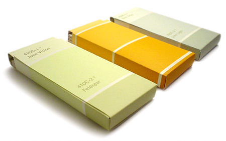
Paint is not the only source of color at our disposal. What about paint chips!

Cozy little cave did a stair way spruce with a little paint chip wallpaper.  Notice the yellow and white painted stripes on the ceiling leading to the magical stair.

Ish and Chi made a striking color wall composition.


Design Verb has a tutorial for how to make business card holders out of chips.


Scott Prendergast used 500 chips from Home Depot for his color fade wall.


- Emily Eifler, Associate Designer, Colour Studio
- Jill Pilaroscia, Principal, Colour Studio

Color culture

Starting a New Year on our Gregorian Calendar brings up reminders of the other new year celebrations around the world. Chinese New Year later in January, Rosh Hashanah (Jewish New Year) in early fall, or the Islamic New Year which moves around the calendar every year. It got us here at Colour Studio thinking about the color of all those different celebrations. What significance is hidden behind the chosen colors, and how do they differ from ours here at home?

We found this beautiful iris of information from David McCandleness over at Information is Beautiful and AlwaysWithHonor.com. They whipped it up back in April of 09. You can see their sources here.

InformationisBeautiful.net


The first thing to pop out upon reading is the closer the concepts are to natural phenomenon the more consistent the color associations are across cultures. We pretty much agree about the color of heat (41) and cold (10), and why not, fire and ice come from nature conveniently color coded. Evil (24), with its associations with the fear and danger of night, is just plain black; while passion (62) and eroticism (22) share the spectrum with red hot heat. Growth (37) is left pure green and squarely in the domain of plants; earthy (20) is brown, and even illness's (44) yellow elicits jaundice skin.

Two examples of color consistency with out direct natural equivalent are jealousy (49), which is all green, and truce (79), which is all white. These represent powerful cultural memes which have likely spread from one culture to the next replacing previous color symbology or maybe just filling in gaps.

As we get in to the more intangible concepts the color cultures diverge. Death (16), for example, is represented mainly as black or white, similar in their lack of hue if opposite in brightness and saturation.  Or take anger (1), which trends toward red but also includes black, perhaps a mix of heat and evil. No one can agree on intelligence (46), love (53), or wisdom (84).

But what would you pick if we were starting our color symbology from scratch? Here are a few of our favorites.


- Emily Eifler, Associate Designer, Colour Studio
- Jill Pilaroscia, Principal, Colour Studio