
 |
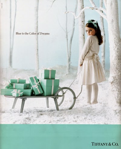
| Image courtesy of Tiffany's' 2011 Christmas ad campaign |
Tiffany & Co.
Tiffany Blue is arguably one of the most recognized colors in brand advertising. The color was selected in 1845 by the company's founder, Charles Lewis Tiffany, for the cover of the first mail order couture jewelery catalogue published in the United States. Trademarked by Tiffany & Co., Tiffany Blue is a private custom color. You can find it in the Pantone system as PMS number 1837, which is the year the company was founded. The robins egg blue was chosen because of its popularity with Victorian brides, and for the turquoise colored gemstones that were in style in the mid-19th century.
 |
| Photographed by Peter Lippmann as a part of the 2011 Fall/ Winter ad campaign, this scene was inspired by Francois Clouet's portrait of Elizabeth of Austria, Queen of France |
Christian Louboutin
Christian Louboutin's provocative red shoe soles distinguish his product from other designers, effectively transforming every pair of seductive heels into a walking advertisement. Louboutin trademarked his "signature" red in 1993. The color is registerd as Pantone 18-1663 TPX and was recently at the center of legal proceedings between Louboutin and competitor Yves Saint Laurent (YSL) for rights to the red sole. YSL has since dropped its lawsuit and Louboutin has expanded the color into a line of nail polish appropriately named Rouge.
 |
| Prada store in Nanning, China. |
Prada
Prada has a history of privilege, which is conveyed in the trademarked Prada Green introduced in 1983. The first Prada shop was opened in Milan in 1913 by Mario and Martino Prada and by 1919 the shop was honored as the Official Supplier to the Italian Royal Household, becoming an established brand amongst the European artistocracy. In 1983 Prada opened a second location in Milan and introduced the pale green that would become known as Prada Green. The new store merged its traditional history with modern styles, establishing Prada as the fashion powerhouse we know today.
 |
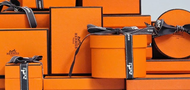 |
| Hermes 2009 Ad Campaign by Raquel Zimmerman |
Hermes
Thierry Hermes founded Hermes in 1837 producing high quality harnesses and bridles for the carriages of the European nobility. With roots in functionality, Hermes orange became the company's calling card in the mid 1950s during World War II. Paper products were hard to come by and the orange color was all that was available for packaging their merchandize. Many decades later, the iconic orange remains the company's calling card and is recognized across the globe as a symbol of quality and sophistication.
| Image courtesy of Digibuzz |
The caveat is color can be highly subjective. While there is evidence supporting the idea that certain colors incite specific emotional responses,( i.e. yellow makes people happy, blue makes people calm, red makes people excited), these responses are subject to other undercurrents that play a role in how color is perceived, such as personal experience and cultural associations. Successful color campaigns balances color psychology with an understanding the brand's target audience.
 |
| Image courtesy of Digitec Interactive. |
While colors come in and out of style, savvy color selection creates a brand image that is both identifiable and timeless. Color is smart business.