Tuesday, December 17, 2013

Color Icon: David Hockney

All images property of David Hockney
To celebrate the end of the 2013 we wanted to give tribute to an icon with a penchant for color. David Hockney, born 1937, is an English painter who has created extraordinary landscapes, portraits as well as opera sets. His work is stamped with expressive color and attitude.  Hockney's recent  paintings are currently on exhibit in San Francisco at the De Young Museum in San Franciso, In David Hockney, A Bigger Exhibition,  feature groves of trees threaded through with open paths. But the unnatural hue of the bark and undergrowth places these forests in dreamland, through the looking glass, on alien and yet familiar lands. His paintings often depict receding landscapes, with empty paths diverging in woods of riotous color.

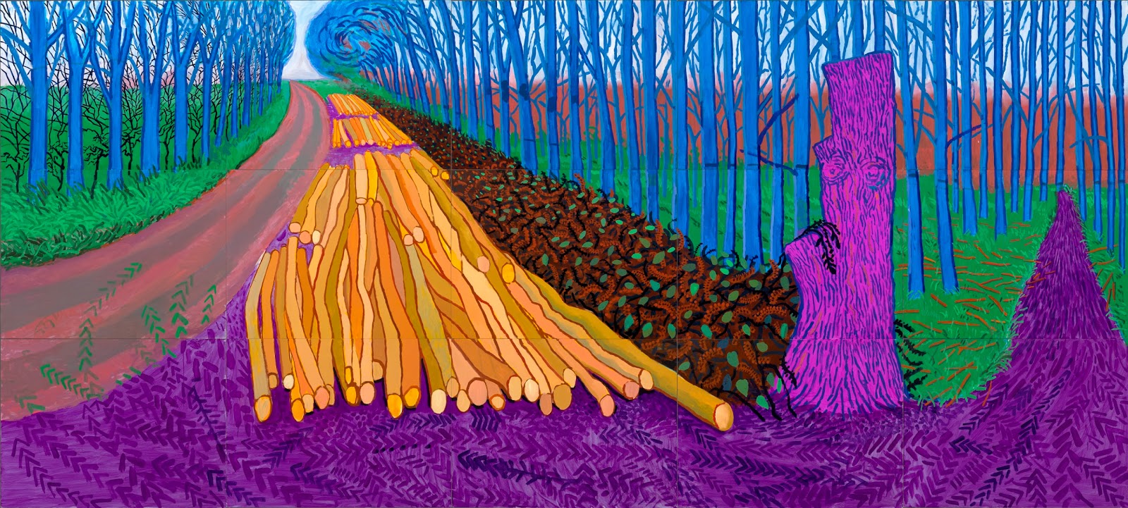
Since this is our last post of 2013 and we wanted to spend it reminding ourselves of why just why we love color. Fortunately, Hockney's work not only uses great color but it also thinks about our relationship to color  as well. Take these three paintings. You can almost see yourself there, at that exact point in that exact forest. That one thick green tree in the foreground, its lowest branch growing bent, anchors you in that place even as the colors and vibrancy shift from image to image.


These three paintings, each with its own inviting path, are a stunning example of Hockney's colorist prowess. Each place is changed not by rearranging the physical space but solely with shifting color. More than just changes in season the forest in each painting grows in a different climate, maybe even on a different planet. In Hockney's paintings color becomes the content, the main idea, of the painting.  These painting say something about the lens through which we see the places we inhabit. That place, the atmosphere, the way it makes you feel, the way it effects your mood and heartbeat and stress level, all of that is influenced by color.

So what do you think? Can we see and make our spaces, and by extension the events that happen there, not grey and concrete rough but brushed as Hockney's forests with world changing color?

See you next year!

Wednesday, December 11, 2013

Spinning, Pouring, Exploding, Floating, and Bouncing PAINT!

Here at Colour Studio we are huge fans of paint. It's everyones familiar source of color. It brightens furniture and interior walls in the intimate spaces of our homes, to the huge buildings, ubiquitous crosswalks, and stunning murals that make up our public landscapes. Paint is everywhere and comes in every color. So this week we wanted to celebrate paint by giving it something it rarely gets in our flat walled worlds: motion! So here are five fantastic videos of paint on the move.

SPIN!


Fabian Oefner, who has also explored the iridescent sheen of bubbles and showers of pigmented powder in his photography work, inspired these spinning phantasms of multicolored paint. Using a rotating disk coated in vicious paint the team at Earth Unplugged whips up some galaxy like beauties with their slow motion camera.

POUR!


Though these amazing paintings by Holton Rower hang on the wall, they are far from flat. After building a series of platforms, some square, some multi-sided, Rower and his team prepare sometimes as many as a hundred batches of different colors. The small batches are then poured over the platform armature and the paint slowly pools over the surface, creating a 3D paintings with a beautiful lattice of paint.

Explode!


A pair of British slow motion camera enthusiasts, The Slow Mo Guys, have done quite a few explosions for the camera over the years but this is one takes paint to the extreme. What happens when you add fire crackers to bottles of colorful paint? Rainbow explosions full of sparks and shattered glass of course.

Float!


If you've never seen this technique let us clue you in. For everything from custom guitars to fancy fingernails, creative painters have taken to floating alcohol based paint on pools of water to get that perfect coat.  This technique lets you swirl, mix and texture your way to amazing color combinations that would never have been possible with just any old paintbrush.

Bounce!


With their trusty slow motion camera The Slow Mo Guys are at it again but this time pouring paint where it was never meant to go: on speakers. With the volume cranked up and the paint applied these guys flip on the tunes and watch the paint fly, or more accurately bounce in time with the beat. 

If you've seen any great videos of paint on the move share them below and lets celebrate PAINT!

Monday, December 2, 2013

Phoenix School Rises from the Ashes

All images property of Prinvault Architectes
Earlier this year in Normandy, France, the Jean Moulin Elementary School reopened after a terrible fire burnt much of its structure to the ground. And this was no accident, the fire was the result of an arson attack. A fire, and especially a fire at a school is a tragic and scary event for any community but this school and the minds at Prinvault Architectes decided to face those fears straight on. Using colors taken from photographs of the fire the buildings new scheme acknowledges the past while looking toward the future, all with color!

All images property of Prinvault Architectes
To achieve the color palette the architects analyzed a digital photo to find that "a spectrum of 2.5% black, 2.5% zinc yellow, 2.5% yellow gold, 2.5% red-brown, 25% orange-red, burgundy 25%, and 40% carmine red "  comprised the hues of the fire.    Once the colors were chosen and organized by quantity the team used a list randomizer to choose the order of the colors along the facade.

All images property of Prinvault Architectes
The interior also transforms the colors of the burning fire into a warm happy energetic color scheme. Paired with a main hallway lined with kid sized alcoves for playing games, reading and studying the whole school feels rich and welcoming. 


So while your next color project may not be on this scale we can take techniques used in this project and apply them to our own for new and creative color inspiration. In a previous post we introduced you to Kuler, Adobe's fantastic color palette creator. Its lets you create color combinations using a straight color wheel or upload an image and play with combining colors directly from it. For our adventurous readers we recommend taking the list of colors you generate from your images and after deciding on the quantity of each (how many times each should appear in your project and thus on the list) pop them in to this list randomizer and see what computer assisted color magic you can come up with. If you use this technique for your next color scheme we'd love to hear about it!

To see more projects by this firm visit http://www.prinvault.com/