Monday, March 25, 2013

Luis Barragan, Architect of Color


“I underline the study of color above all."  Luis Barragan


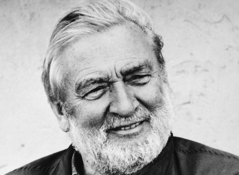
Architect Luis Barragan (1902 – 1988) was not afraid of color.  In fact he liked color in huge expanses and interesting patterns, all juxtaposed with shifting angles and light. He was a man of magenta and cobalt blue, adobe walls, lattices of warm summer yellow, sunset pink alcoves, all on a grand architectural scale.  His vivid sensuous color, space and utilization of light was a bold mix of Mexican and European style born of his well traveled life.


Much like his color, Barragan was a complex man influenced by his friends, family, his education,  travels, and spirituality. Baragan’s parents were wealthy Mexican aristocrats. He grew up riding horses on a sprawling ranch in Michoacan, a region known for its vernacular architecture.   Barragan attended  the Escuela Libre de Ingenieros and in 1923 earned his degree in engineering. Upon  graduation he traveled for two years  throughout Morocco, Spain and France. It was during these travels, experiencing a new world abroad, that a spark for architecture really took hold of him. When he returned to Guadalajara in 1927 he arranged commissions to build several large apartment buildings and a dozen Moroccan-influenced private residences in downtown Guadalajara.

In his early commissions he mixed the styles from abroad into his native mexican architecture and used color timidly assigning it to minor elements; lattice screens, balustrades, and doors.  His palette was dominantly blue, white and red. But upon his return from Europe in 1930, where he met with exiled Mexican political muralist Jose Clement Orozco, Swiss born architect Le Corbusier and  French landscape architect Ferdinand Bac, his practice began to bloom.  These introductions made a powerful impression on Barragan.   From Orozco, he experienced the power of  dramatic color on  a large scale.  From Le Corbusier he learned about the modernist style, and the concepts of the house as a machine.  From Bac, he was exposed to the art of landscape and the ideas that gardens should be enchanted places for meditation.

With the help of these contemporaries, by the early 1940’s Barragan had crafted his personal definition of Mexican International Style. It was a blending of the foreign with the familiar.  He would not sacrifice beauty for functionalism. He refused to subscribe to the idea of “the house as a machine”. He would design “emotional architecture,” places where people could feel and think.  He would use pre industrial materials like adobe and wood timbers from Mexico’s vernacular architecture and integrate sensuous colors into his designs to give dimension to space and add "a touch of magic."


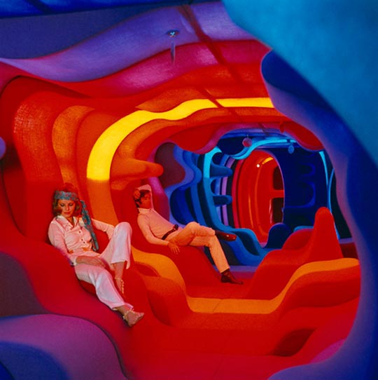
 By the late 1940’s Barragan was using fine arts techniques and painterly placement of color in architectural designs to create pictorial depth,  and enhance the experience of  light shadow and surprise.  His white walls were off set by a wide range of tones: brilliant yellow, pink, fuchsia, magenta, vermillion, cadmium red, indigo, cobalt, sapphire, lilac and deep purple.  Barragan’s colors were not arbitrary but rooted in how his culture experienced the world.    “Colours that blaze in the Mexican sun have always been exuberantly featured in everyday life and rituals.  These colors restore the spirits, of our people, for whose retinas supreme beauty vibrates with the more audacious values and contrasts of tropical colours, of the variegated colors of tropical plants and birds.”


Barragan was married twice and had passionate and intense relationships throughout his life, but preferred to live alone. He did not fear isolation.  “Only in intimate communion with solitude may man find himself.  Solitude is good company and my architecture is not for those who fear or shun it.”  With his monumental walls, he would close the buildings outer boundaries, and open up everything inside with form and careful placement of color.


One cannot observe Barragan’s work without appreciating his reverence for the mystery and power of color to elevate the human experience.  “Serenity is the great and true antidote against anguish and fear, and today, more than ever, it is the architect’s duty to make of it a permanent guest in the home, no matter how sumptuous or how humble.  Throughout my work I have always strived to achieve serenity, but one must be on guard not to destroy it by the use of an indiscriminate palette.”  To him the colors were more than just another design element in the building process. He took color seriously, and he wanted his buildings to take it seriously too.


But for all this accomplishment Barragan's work went mostly unrecognized until, at age 74,  Barragan went from obscurity to celebrity when the Metropolitan Museum of Art in New York honored him with a retrospective in 1976.   Four years later he received the prestigious Pritzker Prize, architectures equivalent of the Nobel Prize. Well deserved for a man who not only brought color back in the forefront of architectural concerns but also help define modern Mexico, a place new and thriving and deeply connected to its roots.


- Emily Eifler, Writer, Colour Studio
- Jill Pilaroscia, Principal, Colour Studio

Monday, March 18, 2013

Personalized palettes

Everyone has their favorite palette of colors, and while some advise heading for your closet when you need to pick colors for your home sometimes we need new, we need different, we need exciting. A great way to break out of old color habits is to turn to nature and observe the amazing palettes that exist  all around us. But once you find that perfect animal or forest picture that feels like a feast for the eyes what next?

Color inspiration can come from anywhere but we don't always know how to utilize it. So this week here on Life in Color we want to show you a great tool for getting comfortable creating color palettes for whatever project you have on your plate. But first things first, we need some inspiration! So with out further ado may we present the Mandarin Duck. These little beauties live in eastern Asia, but strangely enough are closely related to plain  American Wood Duck. The males wear an impressive array of colors to attract the ladies and it's that natural plumage we are are going to utilize to create our  palettes. 


We will be working from one of these pictures but if you would like to work from a dress or painting etc. you just need to take a photo in natural light to allow for the best possible color representation. Now that we have our color inspiration in digital picture form its time to show off our tools. There is no special software required. The magic happens right in your browser. 

Kuler is a free service and color community by Adobe the same company that makes Photoshop and many other products used by designers world wide including our team here at Colour Studio. Kuler is specifically designed to help you create, save, and share color palettes for professional or personal purposes. 

When you first arrive at Kuler you'll see a sea of beautiful color palettes already created by other users. For our current purposes head to 'Create' then 'From an Image'.   Upload your image and start playing. On the left hand side you'll see moods you can select from that change up what colors the algorithm is choosing.  But frankly its more fun to  drag the color pickers around on the image until you find a set of colors that sparks you fancy. Here are some examples using our lovely ducks. 

"Dark"
"Bright" with some customization
"Colorful" with some customization
Once the colors are chosen you can save the numbers that are associated with those colors. If your project is on the computer those numbers can be used directly or you can even convert them into paint colors with the help of online tools. Color is a powerful influence in our lives and now with so many creative resources online for free there is no need to fear a color catastrophe. Kuler lets you play with color and see the results of other users color fun. 

Share links to you color themes in the comments!


- Emily Eifler, Writer, Colour Studio
- Jill Pilaroscia, Principal, Colour Studio

Saturday, March 9, 2013

Stacked House Hotel


Few new buildings bring with them dramatic feelings of both wonder and consternation quite like the newly opened Inntell Hotel in Zaandam, the Netherlands. It is either a beautiful and well thought out conceptual building or an over textural eyesore depending on who is looking at it. Boasting 160 rooms over 11 stories, the hotels appears to be composed of stacked up, interlocking wooden houses traditional to the region.


The various gables lead to roofs below windows or next to cornices and false fronts. It is a maze of old world architecture reworked for modern eyes accustomed to the fast pace of visual information. It is a building that has to be sorted out by the eye not just consumed. And the color choices for the building make the architectural illusion all the more remarkable. Colored in greens and green-grays with a focal spot of high chroma bright blue,  the individual homes seem to melt together in to a truly cohesive whole. 


While it may seem to stand out, perhaps an example of overzealous maximalism, when taken in consideration with the Zaandam area,  the building seems to fit right in. "I didn't set out to shock," said Wilfried van Winden, chief architect of WAM, the firm behind the creation of the Inntell Hotel. "But this is, of course, an outspoken building. And the language it speaks is the architectural language of Zaanstad. It makes a big statement, sure, but the building is not an imposition – it belongs here." After a little looking around we found this image of the Zaandam City Hall. 

Via Ken Lee
When viewed in context of these government buildings from the region,  the Inntell Hotel seems more the colorful eye-catching product of a colorful eye-catching and frankly architecturally adventurous place, than the sore thumb some have accused it of being. Buildings and their color and design choices can not be judged by one photograph from one angle but instead need to bee seen in the context of their geographic location and their neighbors. 

What do you think? Does Zaandam seem like a place you'd like to live or is this outcropping of creativity too much for your everyday eyes? Want to read more about the stacking trend in architecture? This 'Stacking in style' piece  at the  Web Urbanist is a good introduction. 


- Emily Eifler, Writer, Colour Studio
- Jill Pilaroscia, Principal, Colour Studio

Monday, March 4, 2013

Color Icon: Verner Panton


Verner Panton is a color icon. Born in Denmark, he relocated to Switzerland in the early 1960's and became known as one of the most influential furniture and interior designers of that period and in fact most of the 20th century. Famous for his innovations in furniture, lighting and textiles, some color and design lovers may be  unfamiliar with his name but will recognize the famed Panton Chair. 


The sweeping curve of the chair  demonstrated  groundbreaking plastic fabrication.  His use of vibrant color helped define the look of the sixties.   The chair is still appreciated  by vintage lovers from the eighties to today. In fact this classic design has proven so popular it was  featured on the cover of Vogue in 1995 and is still in production to this day by  the Swiss furniture company Vitra.


His legacy does not rest on the back of this single chair. Panton created experimental design environments to test out new ideas to observe how humans actually use space. These environments always employed adventurous use of texture and a skillful use of color. Panton was interested in making a maximalist world with a focus on a sensory feast that could not be taken in all  at once. For Panton the built environment should have the visual complexity of any natural setting. 

Spiegel Publishing House

Below is the  legendary 'Visiona'. Originally an exhibition in Cologne, the design was later reenvisioned as  a cruise ship, the interior of which was designed entirely by Panton and launched in the early 1970's. What looks to today's eyes looks like sixties psychedelics,  at the time explored the revolutionary idea about ways to manipulate the organization of space with color and form.


Looking beyond the cultural bias of seeing the sixties as a drug fueled parade of psychedelic love children,  we can reflect upon Panton's arguments for the use of the vertical space, color as visual meal, and reworking the culturally accepted positions for bodies in public space. Visiona was not just a playground for free spirits  it was an  experiment in how changing spaces changes how we use them.

His idea for multishaped surfaces allowing the user to position themselves for individual comfort didn't catch on. However it did spark a revolution in thinking about comfort and ergonomics in not just chairs,  but in entire environments.


Spaces were not constrained by the formal precision of striaght walls and clear delineation between rooms.  Panton used color  gradations and lighting to engage the user.  Here cool blues became warm reds and then changed to oranges. Feeling a chill and need a bit of heat and conversation? Warm colors draw you and activate interaction.   Need a moment alone, breathing deep, eyes closed? A blue corner might be just the thing. 

Panton wasn't just instructed in the splashy party boat vibe. The toned down, off the catwalk, version of these wave formations is seen here at Panton's home with his wife and daughter. 


The structure takes the lounging intimacy of the couch and turns it inward. Instead of the users all facing the same way focusing outward and generally toward a television, Panton's 'couch' brings the families attention to each other, allowing them to relax and lounge comfortably.  This family nest, encourages repose and connection in what felt, and still feels like a fast paced frazzling world.


- Emily Eifler, Writer, Colour Studio
- Jill Pilaroscia, Principal, Colour Studio