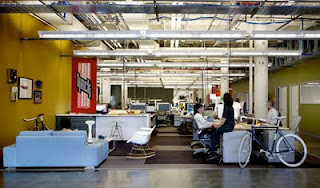
In the 1990s, companies started branding their corporate environments. The trend grew, as the idea that business identity could crossover from advertising media to interior space gained broad acceptance. Many corporations used the same environmental cues to support their brand messages in all their workspaces, whether in London, Omaha, or New York.
Target, Cape Coral, Florida
Innovative companies desired interiors that defied the norm. At the Yahoo campus in Sunnyvale, California, slides were installed to connect an upper floor to the floor below. Who needs stairs when gravity can work to your advantage? Freestanding conference rooms with canted walls in vibrant colors looked nothing like their traditional counterparts. Ebay followed suit with interior colors that matched its logo. New players like Facebook and Salesforce chose enthusiastic palettes reflecting their youthful worker demographic. These environments are bold, fun, festive, and stimulating.
eBay, San Jose, California
Google changes its home page visuals daily. High tech companies of all kinds are constantly adapting their products to reflect new introductions or new services. But should the branded physical environment change as quickly? Does using the precise criteria for branding identity and product make sense in the built environment? Is it a sound return on investment?
Twitter, San Francisco, California
Cultural anthropology has become part of the prerequisite architectural curriculum at architectural institutions like University of Florida. Architects use science and art to design spaces while anthropology focuses on science and people. People who have researched the link between humans and environment like Dr.Heinrich Frieling, Dr. Harry Wolfarth, Frank Mahnke have found that humans need variety in their environments to avoid monotony, visual fatigue and boredom. Access to nature, good air quality, variable light levels, and comfortable and ergonomic furniture all enhance productivity.
Facebook, Palo Alto, California
The concept of one-upmanship in creating dramatic environments sometimes misses the human mark. We all like new, and fun things, but there will be times when color for color’s sake will not carry the clients’ investment soundly into the future. Lets consider if that colorful package design, which visually leaps off a retail shelf will be as successful as a focal wall color in an office environment. Let’s at a minimum question if a branded color solution works in an environment.
Yahoo, Tokyo, Japan
I completely support the idea that each organization has its own culture. The culture may prefer to work in quiet private spaces for specific tasks and then have the flexibility to roam a large floor plan to select informal group work situations. What I am suggesting is that the same amount of time spent on space planning, preparing furniture layouts, and using real estate efficiently should also be spent on determining what is the most beneficial aesthetic environment that will support human needs. Color used indiscriminately to look innovative will not stand the test of time, nor will it serve the brand in a significant way.
Photo Credits
Target: http://www.ryancompanies.com/projects/supertarget-stores/
eBay: http://www.oneworkplace.com/ourclients/portfolio.asp
Twitter: http://viewhometrends.com/twitter-office-interior-designs/
Facebook: http://www.chilloutpoint.com/science_and_technology/google-office-versus-facebook-office.html
Yahoo: http://freshpics.blogspot.com/2009/09/yahoo-office-in-japan.html


Totally true! Colours have an direct impact on the people's mood. That's why most of the restaurants are painted in warm colours like red and orange. Picking up the right choice of colour is most important when it comes to office interior design singapore. Thanks for sharing the article!
ReplyDeleteThis comment has been removed by the author.
ReplyDelete